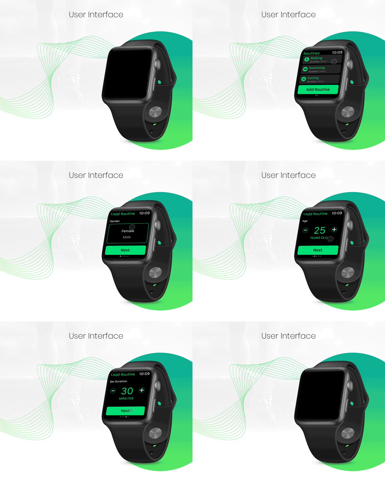

A fitness app that was developed for the iWatch, with the purpose of serving as a friendly personal trainer.
The main challenge was to design a gamified fitness app that was engaging and fun with the given space constraints and at the same time we had to get ourselves completely acquainted with the Apple design guidelines.
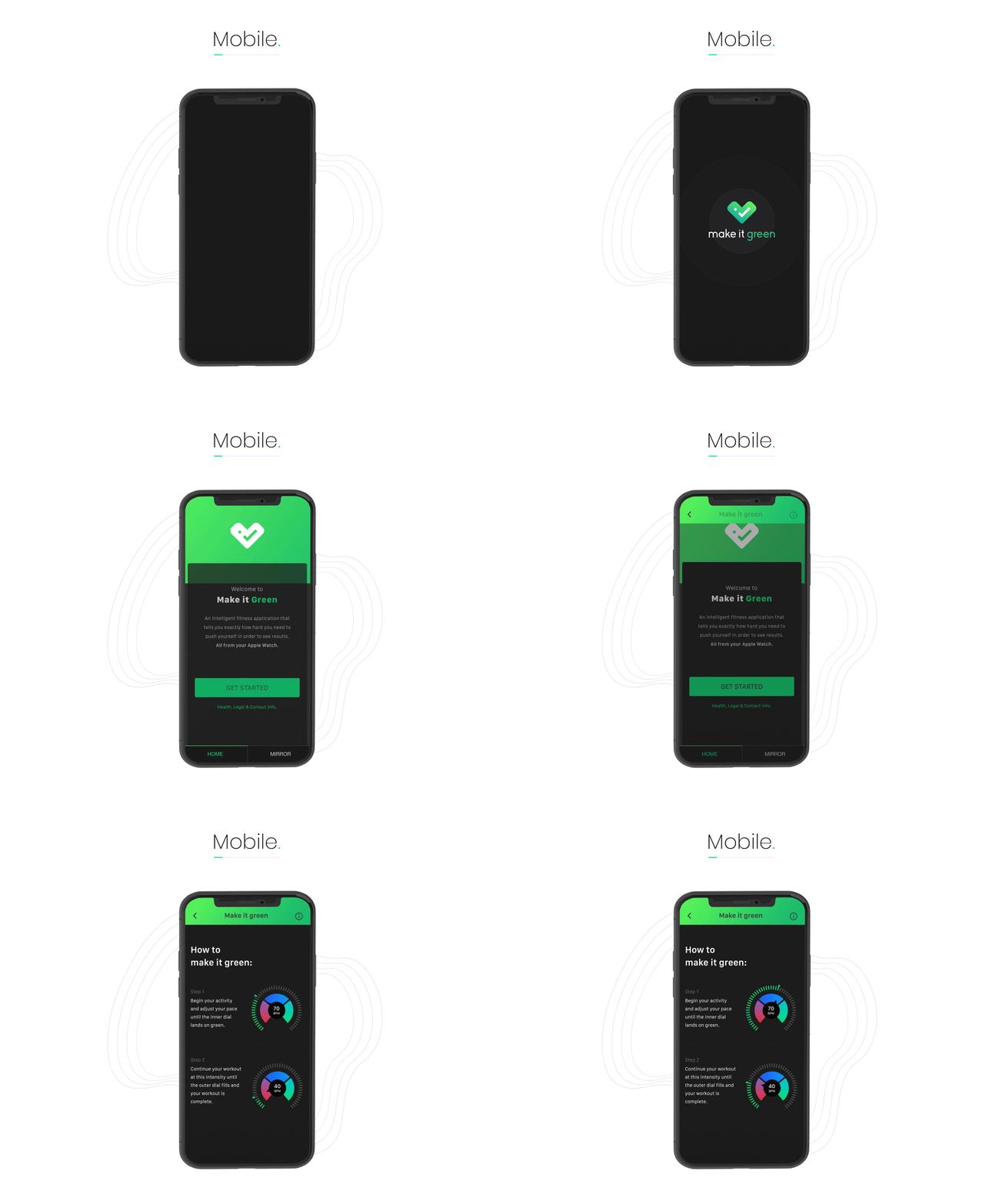
Make it Green is a fitness app that serves the purpose of a friendly personal trainer. It has been developed for the iWatch and can be accessed using the corresponding mobile app. The idea was to develop an app that makes the user fit through self-motivation and not by using external pressure; hence, it will produce results.
The Define phase kick-started with competitor research and we studied various fitness wearables to construct a basic checklist. Next, we studied the design guidelines for iWatch and the platform in itself closely, to understand the possibilities and limitations of iWatch.
This stage helped us understand that the most important feature that we were required to provide to our target audience was personalization and gamification. Research also provided us with the unique features that could add as a USP for our application.
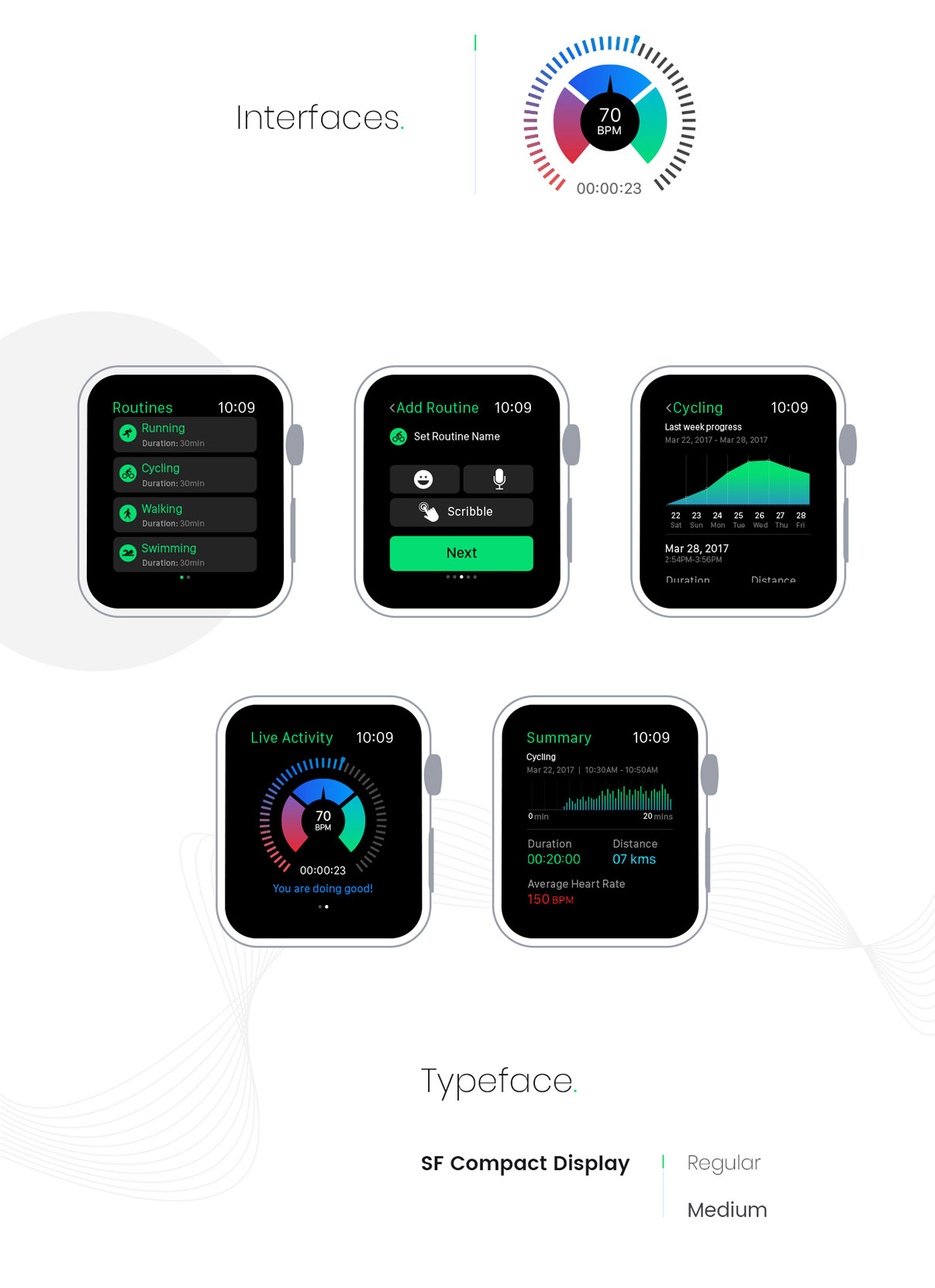
MIG allows a user to choose the optimal fitness plan and difficulty level according to their preferences. Few of the unique features that we incorporated witnessed the voice over interface that gave real-time feedback if a user is falling short of completing the set task; second, based on the performance chart, the app suggests the possible fitness plan to users by sending push notifications; and, real-time feedback on the user’s performance score was also provided. For gamification, we introduced rewards and badges which they could share on their social media platforms.
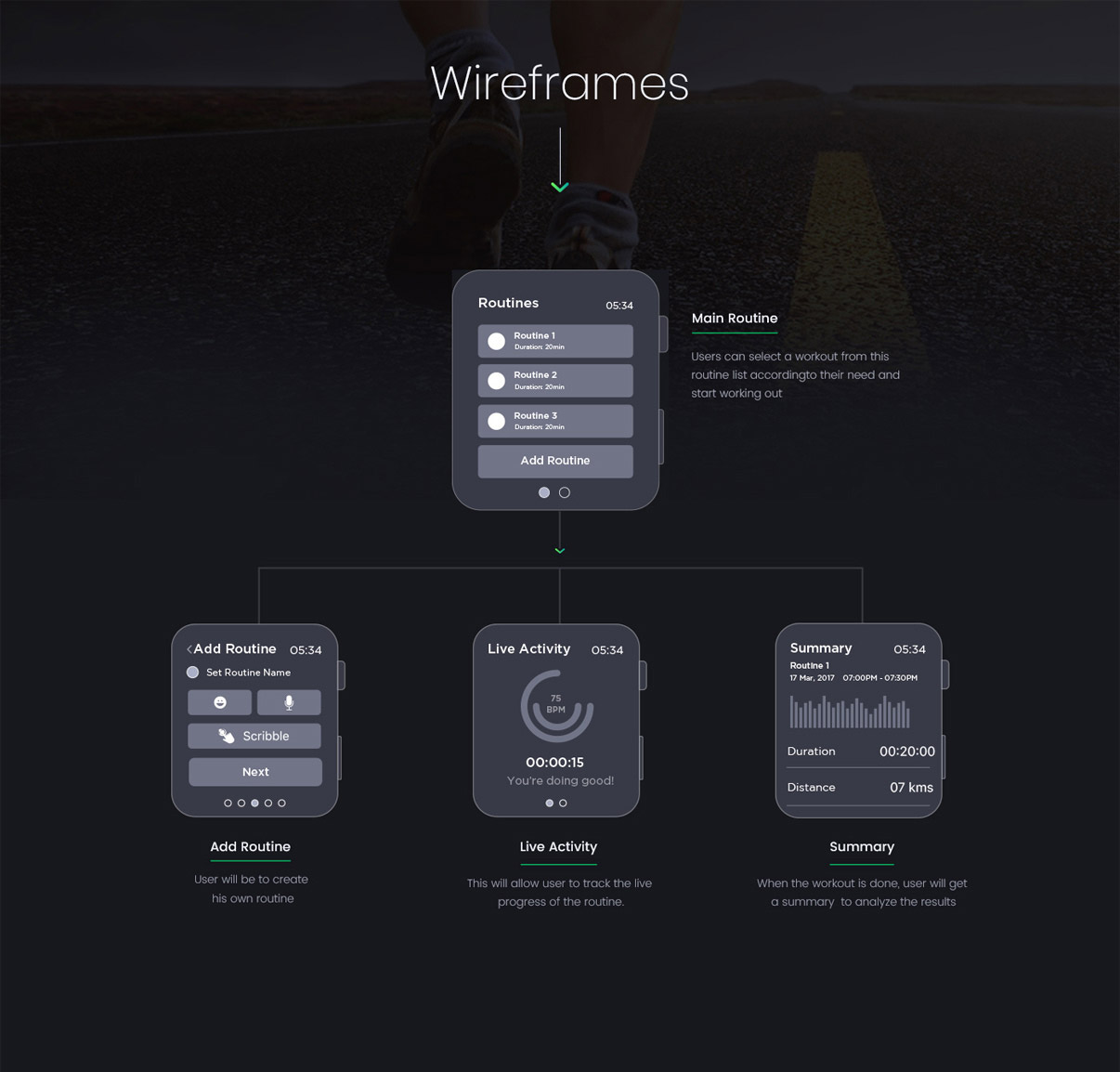
Only during the onboarding stage, users are required to set their routine for a month/ week depending on their choice and thereafter, it’s just a matter of one click to track and monitor their fitness. The main screen has all the important information that user might require.
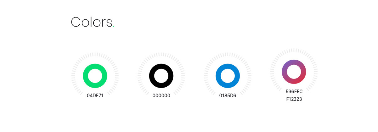
MIG logo is a representation of a healthy heart and the tick mark in the logo symbolizes the awareness and action towards fitness. The colours of the logo are synonymous with the name ‘Make it green’. The app aims to be a part of users habit by positively motivating them, hence, a progress circle has been designed in a manner that it turns green with a tick mark when a user completes daily assigned activities successfully.
For best design practices, we have followed the design guidelines of iWatch throughout, be it in the selection of colours, fonts, icons or interactions.
Since our platform provides space constraints, icons have been kept to minimal, basic and made bold for increased familiarity.
