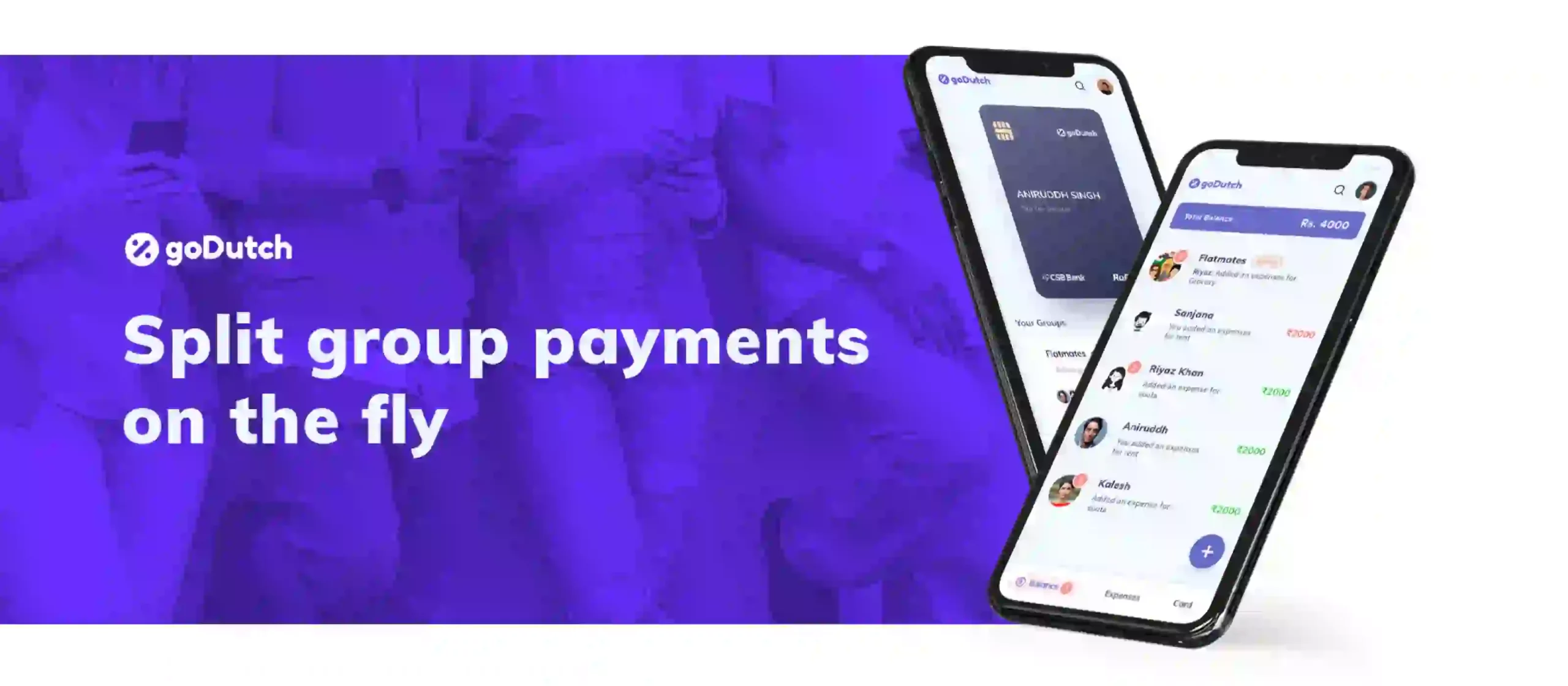

A one-stop platform to help millennials manage payments, and share expenses without the hassle and awkwardness of reminders, delayed payments and multiple transactions.

Who doesn’t like to live a debt-free life? But sometimes, don’t we unknowingly end up forgetting that someone else paid for our food bills a few days back? Or don’t we feel a little let down when our friends don’t pay for theirs? Well, these are quite a common challenge especially for the eager beavers who hardly find time to settle the ledgers.
To address this issue, goDutch came up with an amazing idea to make group payments a cakewalk for people. They wanted to develop a mobile app that manages group payments, without any worry of awkward reminders, delayed payments or multiple transactions.
For team Lollypop, the key challenges while designing this app were to understand the diverse behaviour of the millennials and what they expected from such an app. To get the aesthetics right for the target audience was the key to a successful product launch.
We collaborated with the talented team of goDutch with an objective to design an experience that lasts and grows on user’s cognizance with time. goDutch team assisted and guided us in understanding their product’s purpose and it’s perceived usability by the users. A thorough understanding of their business model and product’s core objectives coupled with our extensive experience in the fintech domain helped us identify the right approach towards determining the design language for the application.
When creating the design for solutions that involves monetary transactions, the designers should always strive to instil trust within users. Refined aesthetics and intuitive usability are the two principle ingredients for building trust. We focused on greater usability to inspire confidence in users, and on the aesthetics to increase the desire of using the app. While we aimed to adopt a progressive styling, we ensured to maintain a sense of order.

We adopted a minimalistic approach while designing the interface of the application. The reason behind was to keep the app extremely intuitive and easy to use. The core ideas were to facilitate users to finish an activity in just a few taps while applying minimum cognitive load. Subtle colour tones worked well to keep the interface light and intuitive. The typography style has been selected keeping easy readability in mind.
