

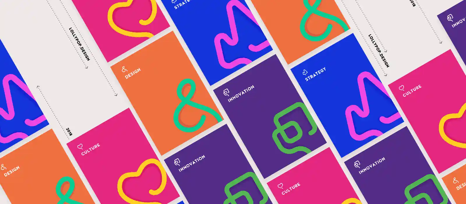
“The Only Thing That Is Constant Is Change” – Heraclitus
Rebranding is always challenging but embracing the change that reflects our evolved mission and values can only be described as a sweet experience. At the core, our new identity reflects that design is pervasive and can empower and touch every life irrespective of any industry or boundaries.
We have always been grateful to the design community and our well-wishers for supporting us and loving our story to date. With this new wave of change, we hope that everyone will connect with us once again and hence, we write what the change is all about.
Our mission has evolved from spreading awareness about the power of digital design to empowering lives through digital design. This massive transformation called for a change in our attitude and our approach; our new brand system reflects that Lollypop is not just about transforming businesses but every idea has the potential to empower and touch lives through the digital platform. The look is informational and vivid; it showcases case studies from various domains, research-based whitepapers, and many projects. Bold colors, playful illustrations, versatile typeface, rich imagery and use of white spaces bring about the stunning vibrancy.
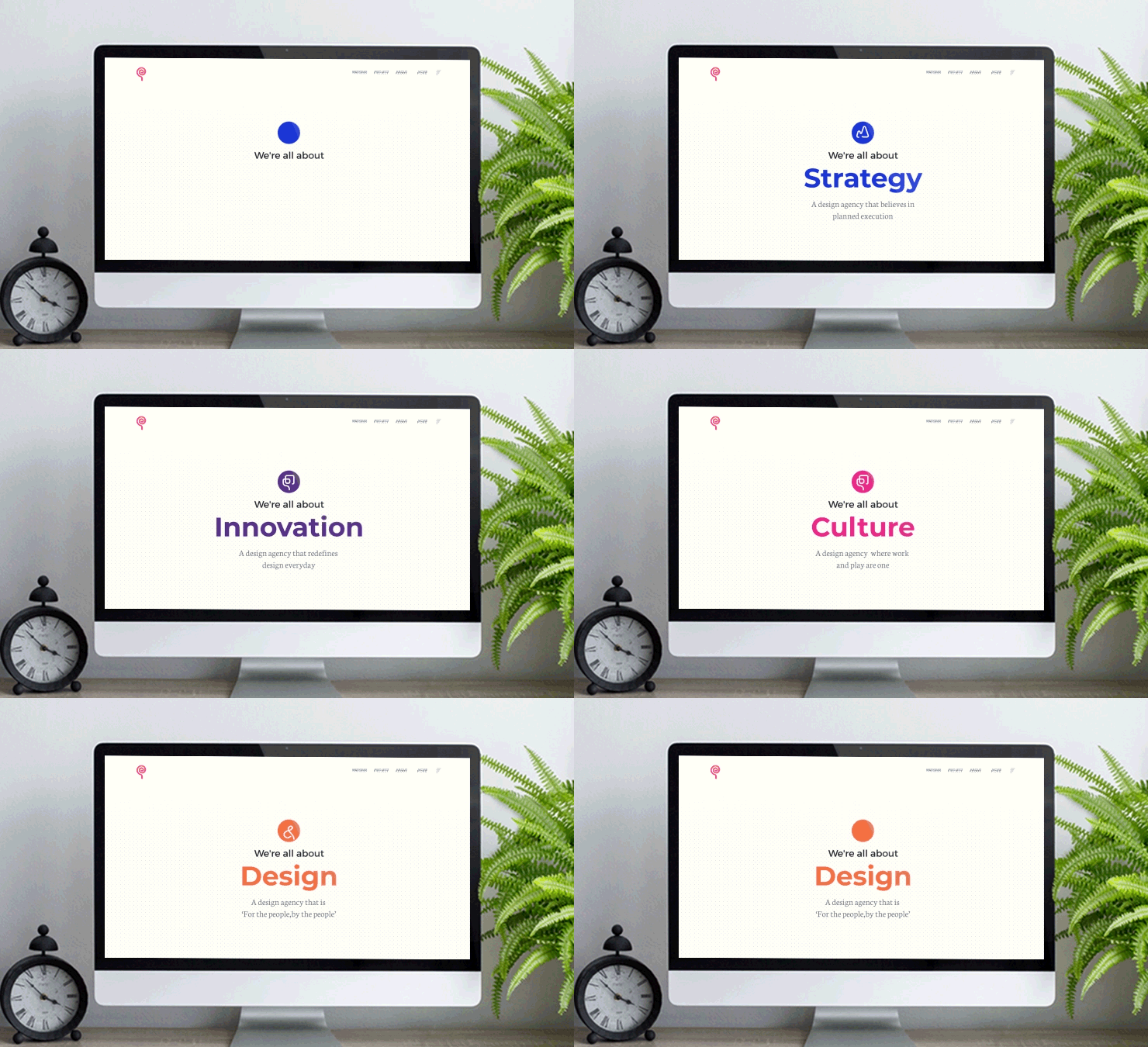
Our users range from design enthusiasts to entrepreneurs and are from the gamut of industries. They have always shared the misconception around design. Previously it was considered as visual representation and today, though many understand its importance, it still is not considered as a crucial part of strategy. Our brand message is clear- Design is at the heart of culture, innovation, and strategy.
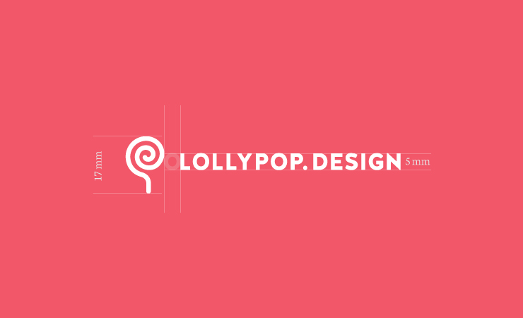
First thing was to revisit our logo. Since rebranding is all about being adaptive and flexible, we decided to stick to our current logo itself. Lollypop is derived out of voidness, it is all about imagination. The stick can be molded into different forms and shapes reflecting how we are open to change. Second, it is all about spreading sweetness in everyone’s life by combining strategy and emotions; hence, it represents a fresh piece of candy, probably the taste everyone remembers since early childhood! In fact, a very pleasant experience and memory 🙂
Since our approach is very expressive, we adopted visual representation for each shape and carefully crafted each one of them. They all have roots in research and hold significant meaning in themselves. Below, we have illustrated the reason behind each shape:
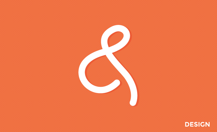
Earlier pronounced ‘and, per se and’, the popular ‘&’ symbol adapts beautifully across types, styles, sizes and has been adored by designers for years. It has even enjoyed the position of the 27th alphabet for a while, before being removed. The reason why design is so effective is that it binds 2 quintessential things- technology and emotions. Design bridges empathy and science the way ‘&’ connects two parts of a sentence, giving rise to spectacular results. Thus, our shape for design has been inspired by the ‘&’ symbol.
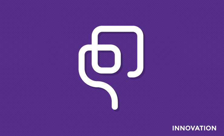
Innovation is the application of improved and efficient solutions that meet new requirements, unarticulated needs, or existing market needs. It drives design to create solutions the world has never seen before. The shape we used for Innovation is inspired by the filament of the incandescent lamp, which completely changed the way the world worked. It expanded the horizons of the timings in which humans stayed active, improved security and sent sparks flying for countless other inventions.
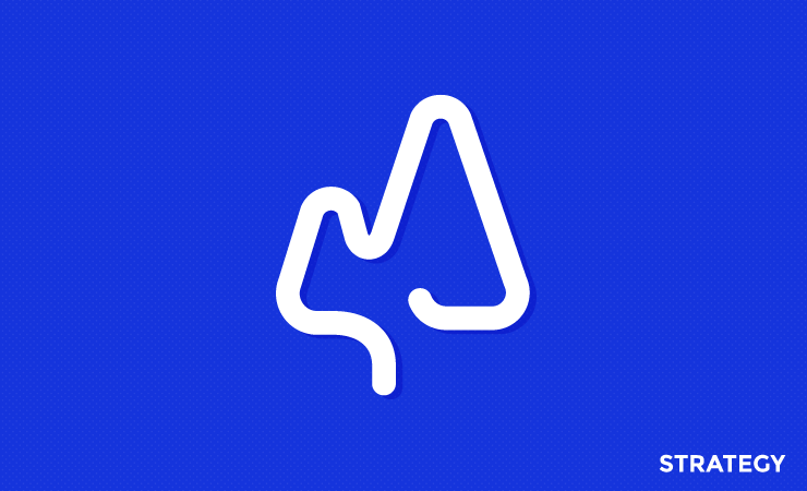
The shape for strategy has been derived by combining two elements; one is an upward growth of a graph depicting success and prosperity and second, the culture that mirrors philosophy and values. Business and technology alone cannot drive success, they have the strong foundation of a dedicated team and acute design thinking.
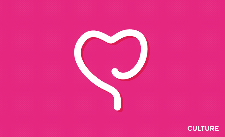
While ideating a shape to represent culture, we knew that it had to reflect the essence of oneself in all possible sense. Values and philosophies are functions of the right brain that derives its roots from creativity and heart. Hence, we froze on a heart shape.
We introduced patterns to reflect our processes and work ethics. They are about what Lollypop stands for and that is our relentless pursuit of achieving innovative designs that evoke emotions. Hence, they have been used profusely all throughout our website. The two patterns that we have used are hexagon and triangles:
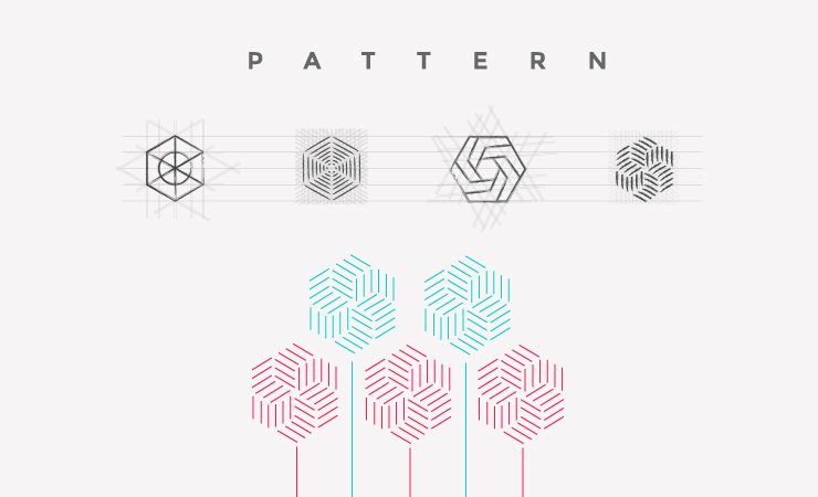
Hexagon symbolizes harmony, balance, and efficiency; it is arguably among the most sacred symbol of geometry and is present in nature in abundance. The shape itself is an amalgamation of a circle and a polygon. It has the extensiveness of a circle, but also the definitive angles of a polygon.
For us hexagon is the balance that we bring between the two extremes; first, analytical thinking & emotions and second, technology & empathy. It mirrors the Lollypop pursuit of achieving design excellence by balancing the extremes nature into one beautiful solution.
Associated with power and energy, ‘Triangles’ have been part of the visual design and have had religious importance for a long time. They are used in architecture for their stable structure.
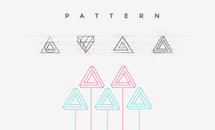
For us, Triangles are symbolic of the Lollypop process- Discover, Define, Design. Like the sides of an equilateral triangle, each of the three steps weighs in equally as they work in harmony with one another to produce strong, creative designs. Triangles also suggest movement and direction, which we can relate this to the journey of Lollypop- always learning and expanding. We aspire to progress, grow upwards and always shoot for the stars.
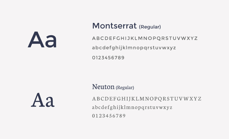
Lollypop has evolved to being recognized as young vivacious professionals with strong work ethics. We are agile enough to align ourselves to the aggressiveness of a startup or design matured experiences for bigger brands. Thus we decided to introduce two fonts, Montserrat and Neuton that communicated our personality. Montserrat, a modern sans-serif font brings the bold and fun flavor of our personality whereas Neuton emulates our strong and serious stance towards the work principles.
Colors have a deep impact on emotions and perceptions. This time around we wanted to introduced a set of vibrant secondary colors that can communicate our brand message clearly. We continued Red as our primary color because it represents the core of Lollypop’s principles that are passion, honesty, love, and courage.
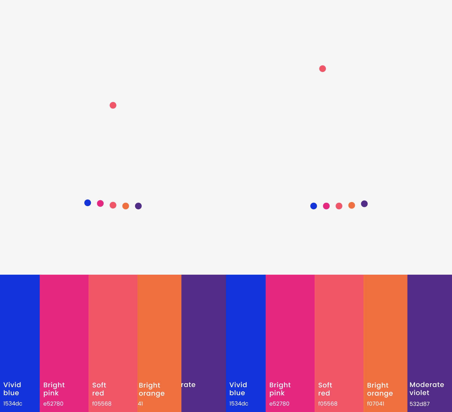
This color represents the depth, the calmness, and the stability. We believe Lollypop is all about giving 100 percent, unearthing the unknowns and with a calm mind take new challenges to outdo ourselves. Hence, blue represents the ‘Strategy’ shape.
The color pink is all about contradiction; it is feminine yet is masculine as well; it is shallow yet tender. It represents love, calmness, innocence, and optimism; here at Lollypop, we value each opinion and every individual. We go by the motto of ‘be hard on problems and soft on people’; hence, we are all pink in our ‘Culture’.
The color that evokes happiness and creativity was chosen to represent ‘Design’. For us, it’s all about going that extra mile during our design process which in turn brings happiness to the clients and us as well.
This color symbolizes power and ambition; it is a mix of red and blue, wherein it takes energy from the red and balances it with the calmness of the blue. Hence, we chose purple to represent ‘Innovation’.
For us the layout had to achieve the two fundamentals; first, the content had to be the king and second, our narration had to be intensely captive. With this thought as our foundation, we decided that this time around we will be Bold, Beautiful yet Simple. Our designs focus on telling a story with zero clutter.
We have used three approaches for our layout; free, frozen and fluid. The free layout gives importance to the content, it had no other element be it borders or graphics. Frozen layout, on the contrary, has defined background colors and is supported with graphics. Finally, the Fluid layout gains your attention with the help of our portfolio or secondary colors.

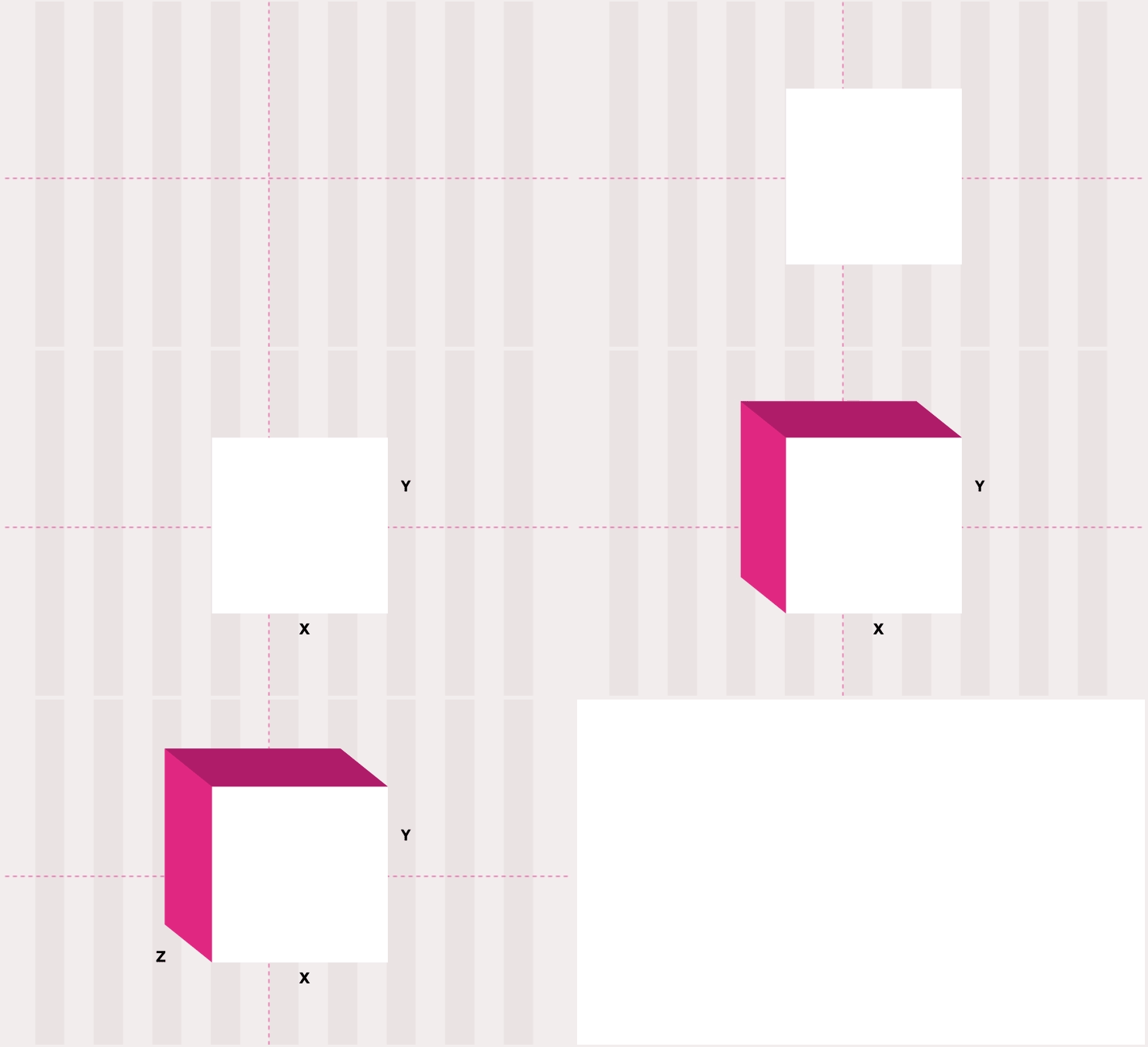
Throughout the layout grid was maintained; X and Y axis was used for placing the content and supporting graphics while Z axis was used to create the hierarchy and depth in the story. The extreme white spaces helped create visual breathing space between stories for pleasant user experience. We couldn’t put the Z Pattern shape in practice as we took a straight line approach for our layout.
It’s of absolute importance to have a well designed and intuitive digital interface for your users and clients. With the current exercise on our website, we were able to increase the visitors by 24% on one hand and achieved a massive 35% fall in bounce rates.
