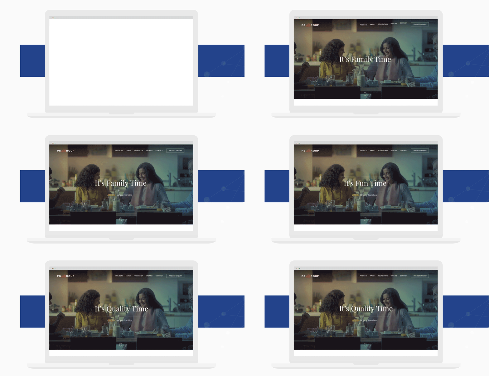

A conversational, user driven website that would showcase a wide variety of projects for PS Group - one of India's largest developers.
PS Group is one of the most renowned brands in Realty space with a pan India presence. They have been in business for over 3 decades and are always open to embrace new technology and trends. They approached us with multiple concerns, major being the ability to reduce the bounce rate from their website.
We had several sessions with the founders where we understood the vision and positioning of the brand. It was clear that we had to be extremely consistent with our communication to embody the concept of ‘It is the family time’ throughout the design. Another insight that user research provided us was the need to be able to filter the projects as per their choices.
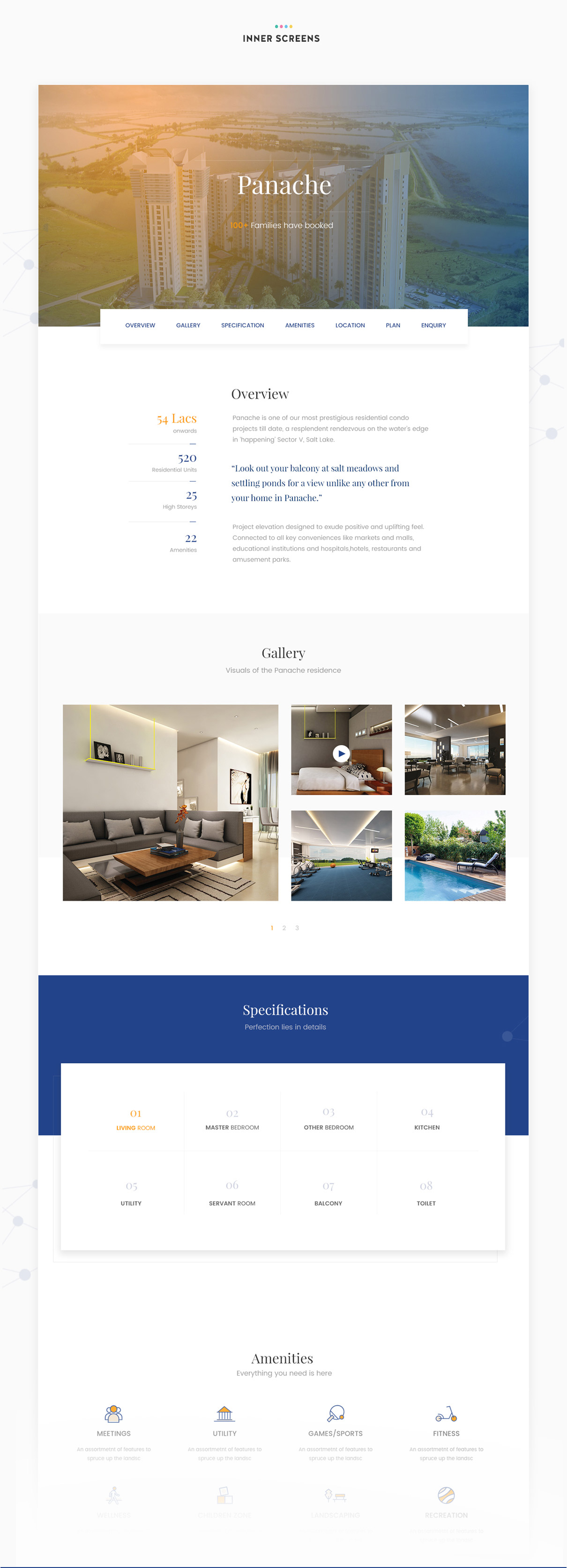
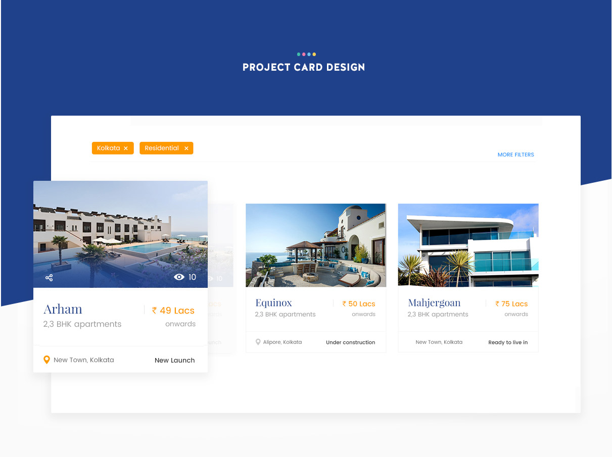
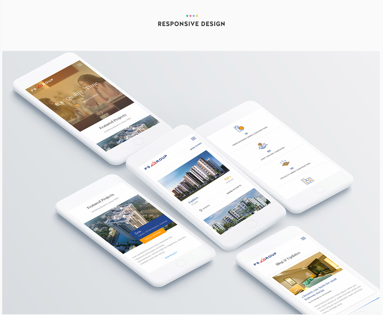
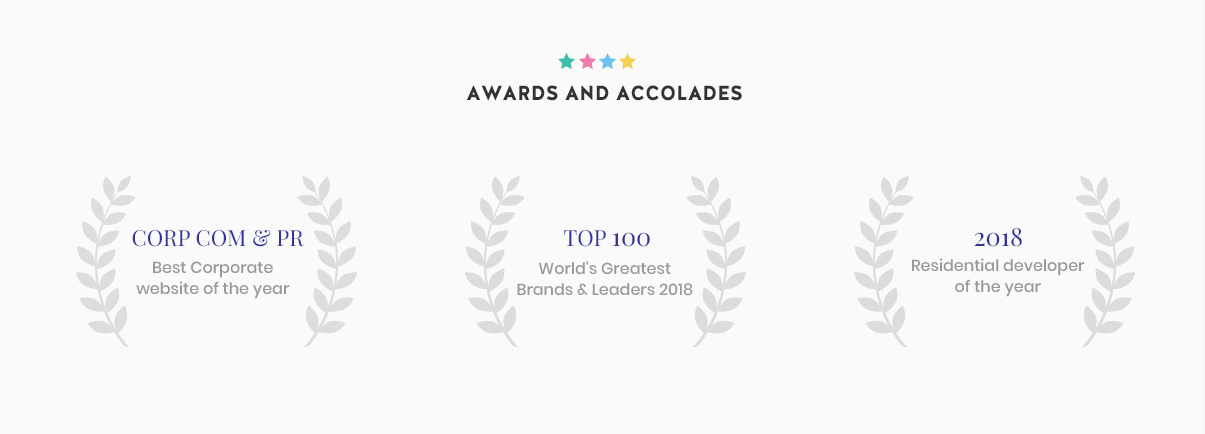
After collating all the insights and persona mapping, we began with structuring the major functionalities and user flow on the website. We ensured that users were empowered with filters such as the location, budget, rent and every other possible filter that was required to ease the search of the project. Beside adding useful functionalities, we also took a close look at the landing page where we provided the snippets of projects, awards and testimonials to drive and reinforce the trust of the users. We have tried to make the design very user driven and conversational.
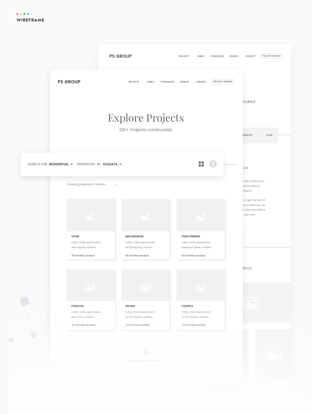
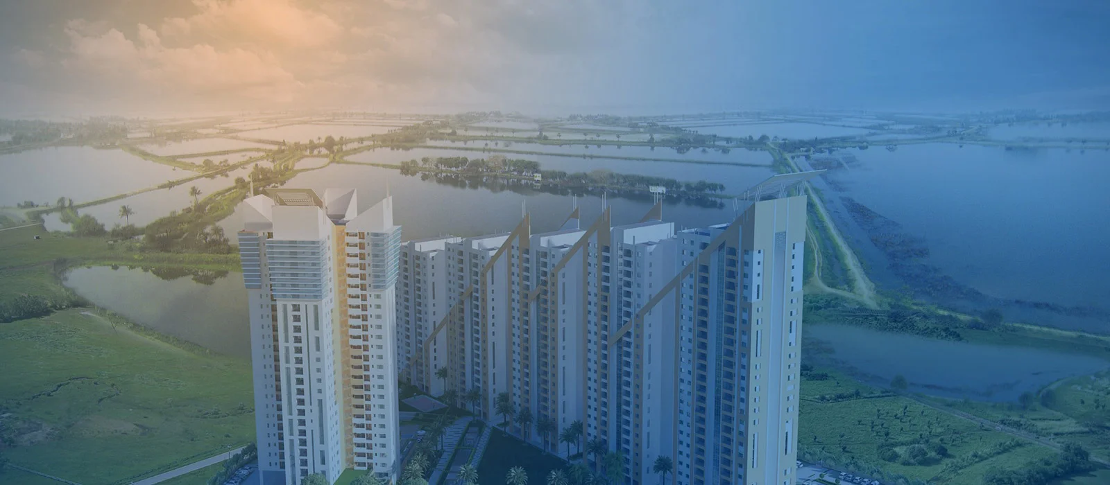
The whole design is extremely interactive with lot of micro-interactions in place; this was done to ensure increased user engagement and to grip user’s attention. Website is made image heavy to give the real-life experience to users with pictures of various completed and ongoing projects. Users can view project snippets on a carousel, and the one which peeks their interest can be selected to gain an in-depth understanding.
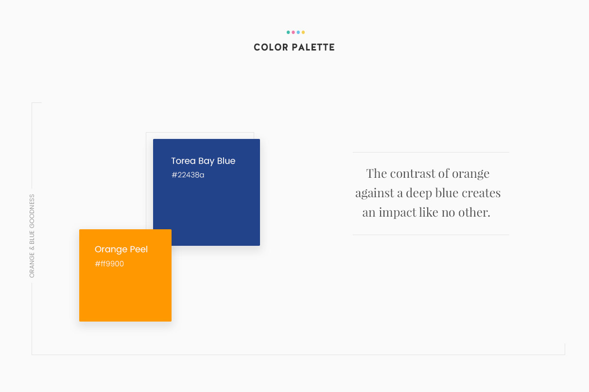
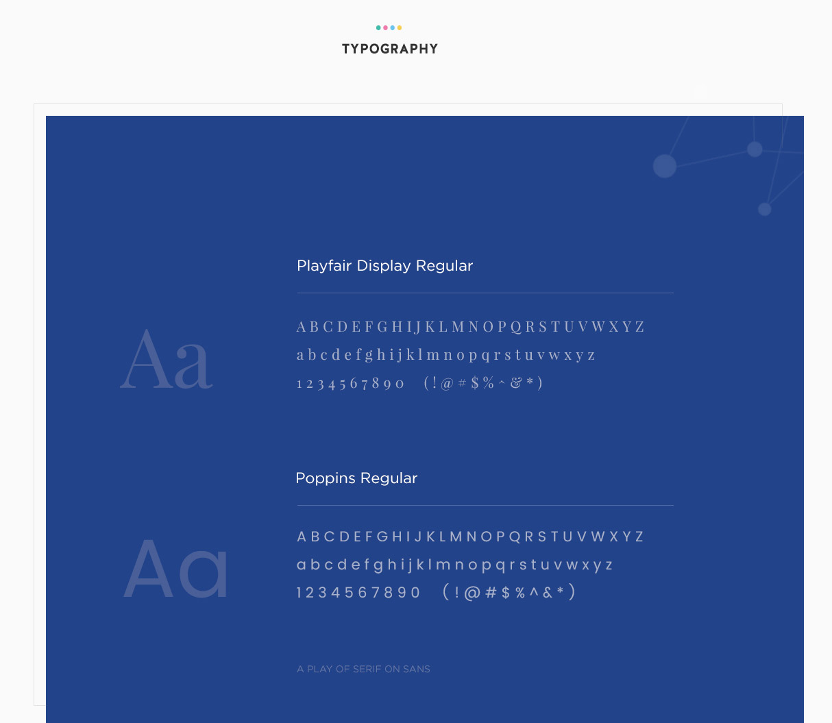
The primary color is blue which has been taken from the logo and we have introduced orange as a secondary color. This is to balance the royalty with excitement, intelligence with warmth and to maintain the beautiful contrast that it brings in. To maintain the subtlety of the design , we have used lot of white spaces and the design follows a card style layout to give an extremely neat structure and to help users focus on the content.
