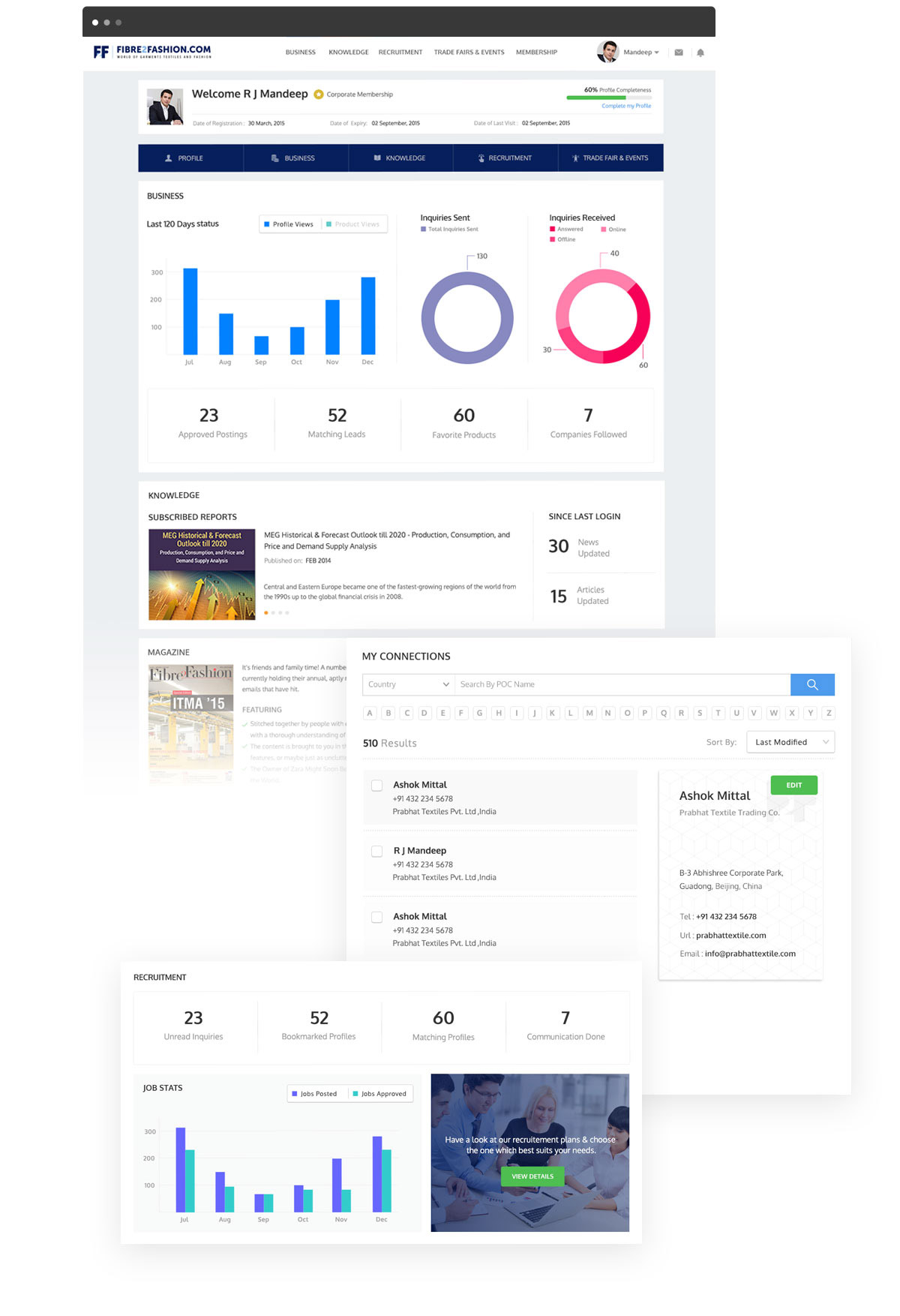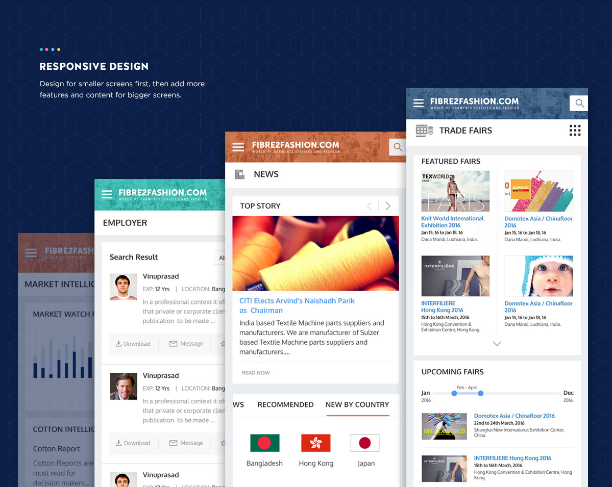

One of the world’s largest B2B platforms for the global fashion industry, we designed a website which has a digital presence in more than 190 countries with 1800 plus products under 13 categories. It is a simple platform to navigate through for latest news, articles and updates about the textile and apparel industry.
Fibre2Fashion is amongst the world’s largest B2B platforms for the global Textile-Apparel and Fashion industry and has digital presence in more than 190 countries with more than 1800 plus products under 13 different categories. Besides providing effective business solutions, they are also a one stop solution encompassing knowledge, recruitment, trade fairs, events and consultancies.
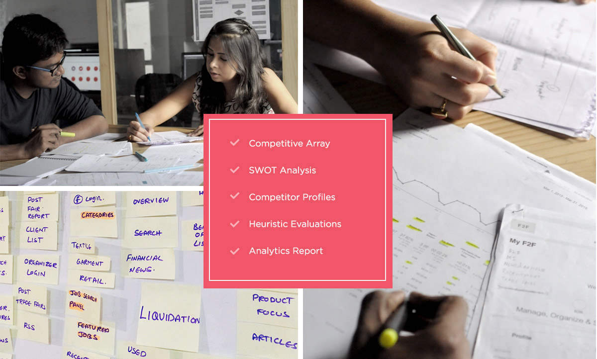
The website required lot of clarity as it was data driven and also served as B2B and B2C platform. The most challenging aspect of the website was data complexity, data criticality and the need for data visualization. Moreover, the site required lot of communication embodying the simplicity as the majority of target audience belonged to business class with little or no interest with regard to digital platform. We had to meet with the founders very often to understand the entire business module and value chain. Moreover, lot of research went through to understand the requirement of the users for proper categorization of the data and building a hierarchy which would guide users to the entire gamut of services provided by Fibre2Fashion. We spent lot of time ideating and iterating the flows to have a perfect solution that would interlink all the services provided by the client and help educate & engage users through all of them.
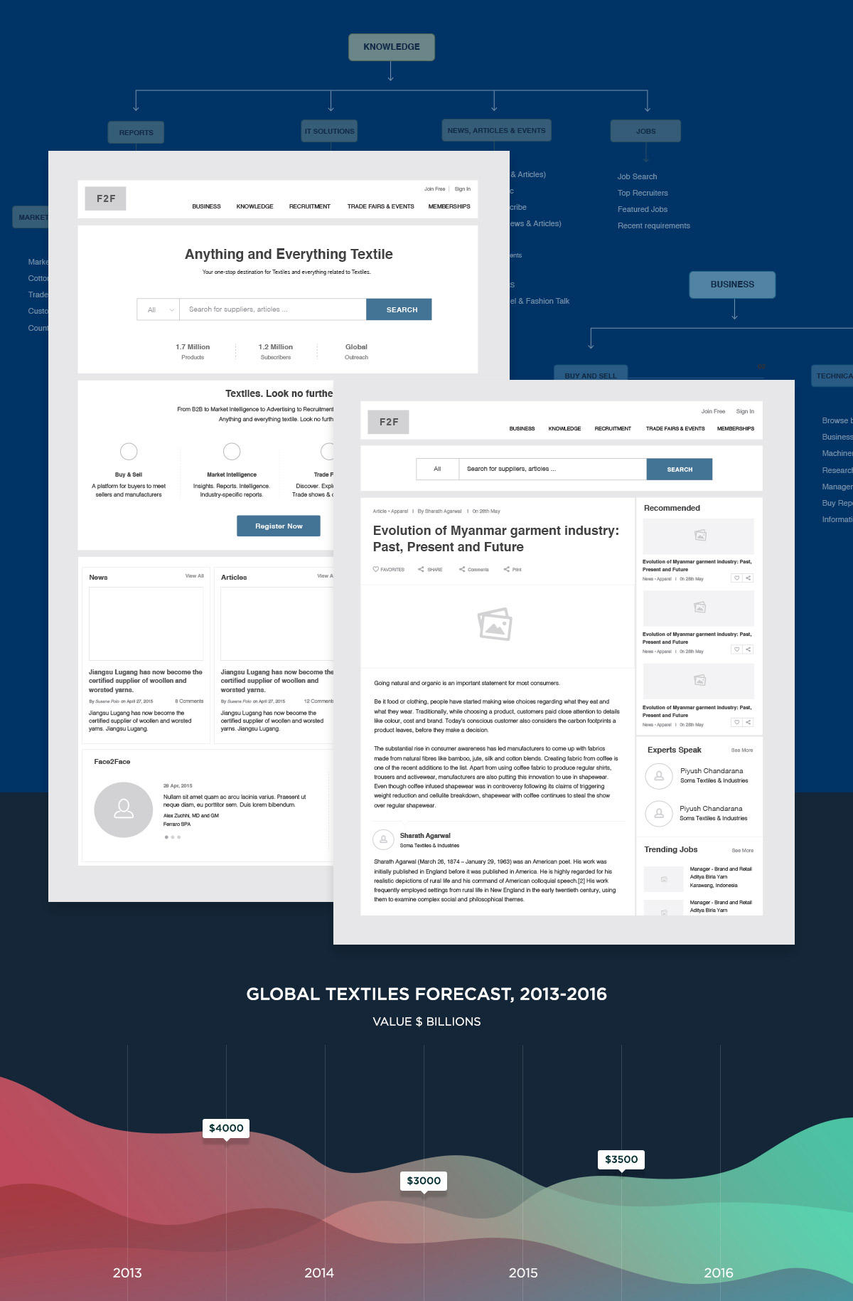
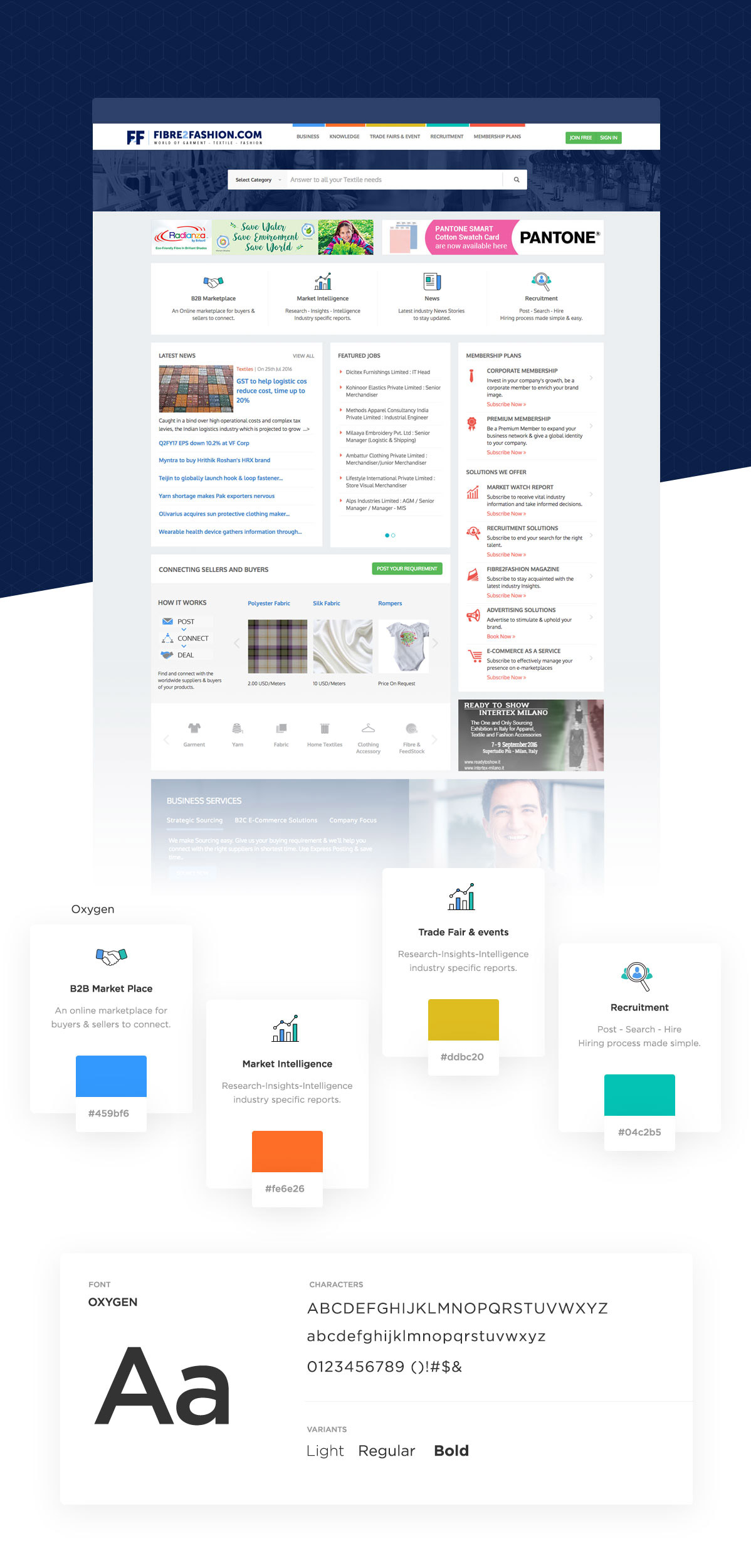
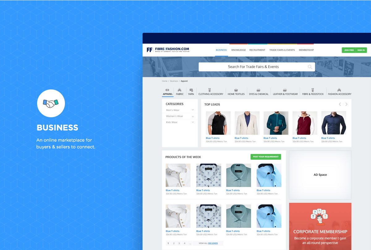
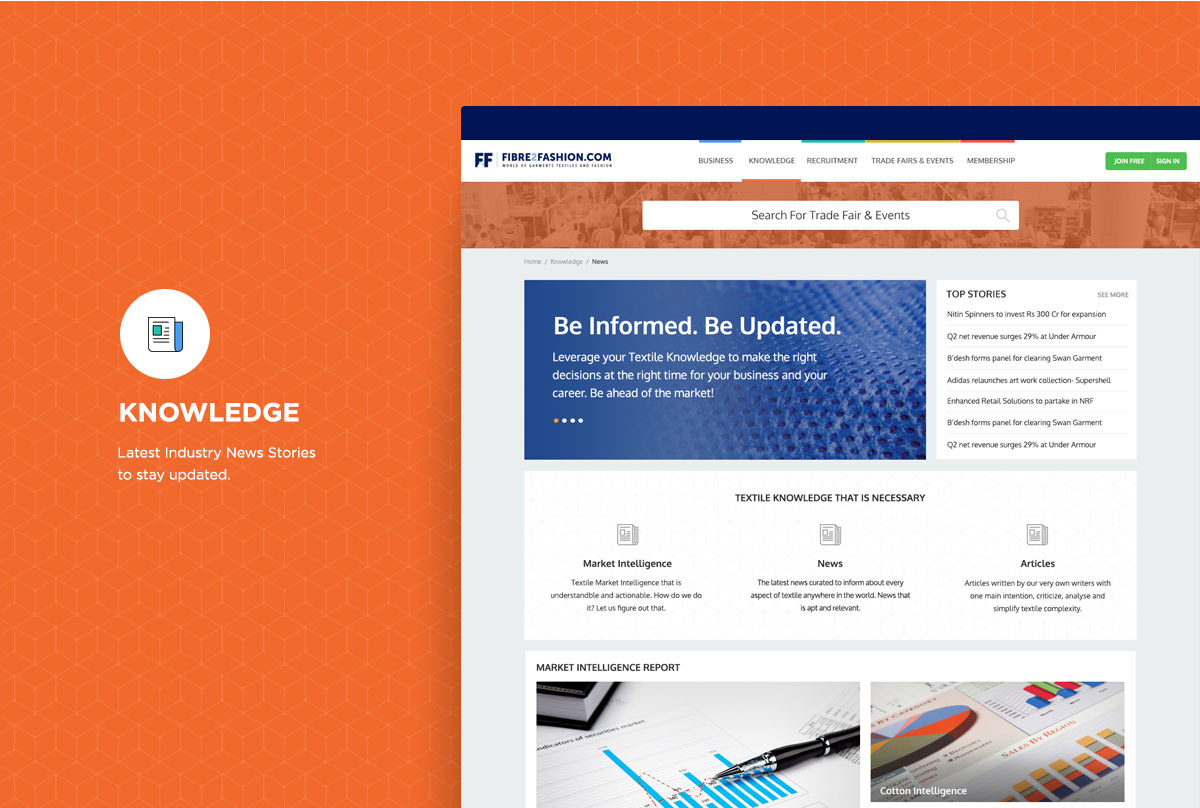
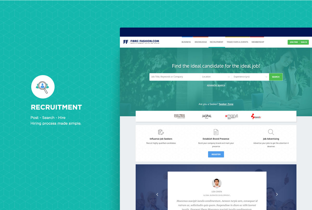
A website such as this required a well-defined navigation with distinguishable differences since it is data driven. Service was segmented into five modules; a primary color for each module was introduced with the same overall layout. Lot of white space was used to make way for information and royal blue color was provided to the overall identity, signifying that website serves as the King in its industry. We also played around with loads of icons to aid quick understanding and movement. The website successfully provides all the information just with a glance and is extremely simple to use.
