A multi award winning project that made us the preferred design studio for crafting experiences for the farming and agriculture industry.
More than 50% of the Indian population is dependent on agriculture and almost 85% of the farms are below 2 hectares. These marginal farmers often struggle with the historic obstacle of isolation and have zero access to educational, scientific information. This directly results in poor yield and no profits.
There were several challenges. First, we were designing for the unconventional audience which is less tech-savvy and has experienced internet over the phone.
Major technological challenges were the poor connectivity, low-speed internet and, poor RAM phones. Whereas, the main design challenge was to have a visually heavy app that a farmer could relate to. To tackle these challenges, we decided to make the app really light by keeping design assets to the minimum.
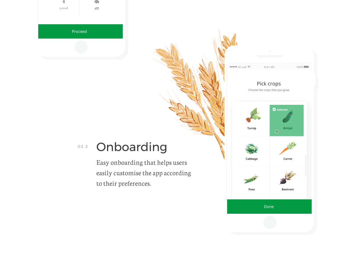
We have leveraged our learnings and research insights into designing this app and making it extremely usable. For example, throughout the app, only tapping behavior has been used as the users weren’t comfortable typing.
The Climate Corporation aims to help the farmers across the globe, sustainably increase their productivity, with digital tools. By combining deep experience in science, technology, and agriculture with real-world problem-solving skills, the Climate Corporation team delivers proven, data-driven solutions to farmers every day.
The client approached Lollypop with the agenda of augmenting the user experience and further develop feature capabilities of one of their Android applications called FarmRise. This app was conceptualized to help the Indian farmer community optimize their resources and maximize their yields and profits by utilizing the information and attributes provided on the app.
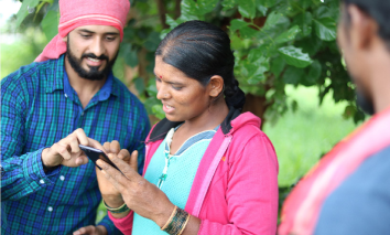
In order to provide the best possible experience to the farmer, it was important that Lollypop team had a clear understanding of the current user groups and potential target audience the app was going to serve. We began with research, we had multiple sessions with the FarmRise team, stakeholders, and the key decision makers to gain a better understanding on agronomy, application, the vision of the company and goals of the app we were to design. Second, we conducted Ethnographic Research, such as user interviews and observational research techniques with 150+ farmers over a period of 3 months in several villages of Karnataka and Maharashtra.
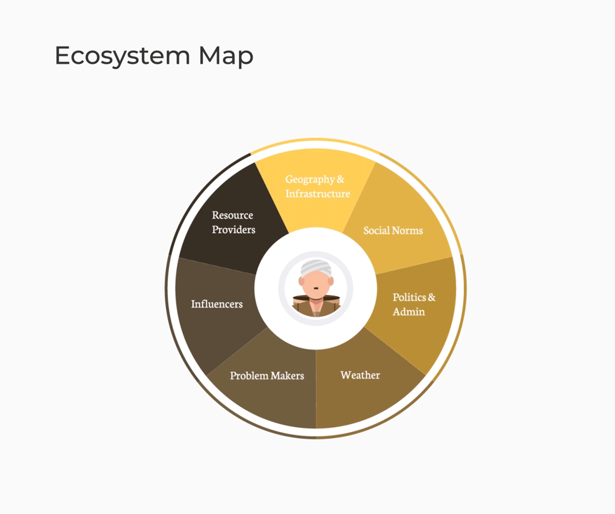
The research helps us gain insight on the farmers day to day activities, processes, crop cycles, and the cognitive factors that help them in decision making. We also understood the ecosystem in which the farmers operate, the frustrations that they go through along with the factors that could motivate them; and these helped us craft out various features in our app.
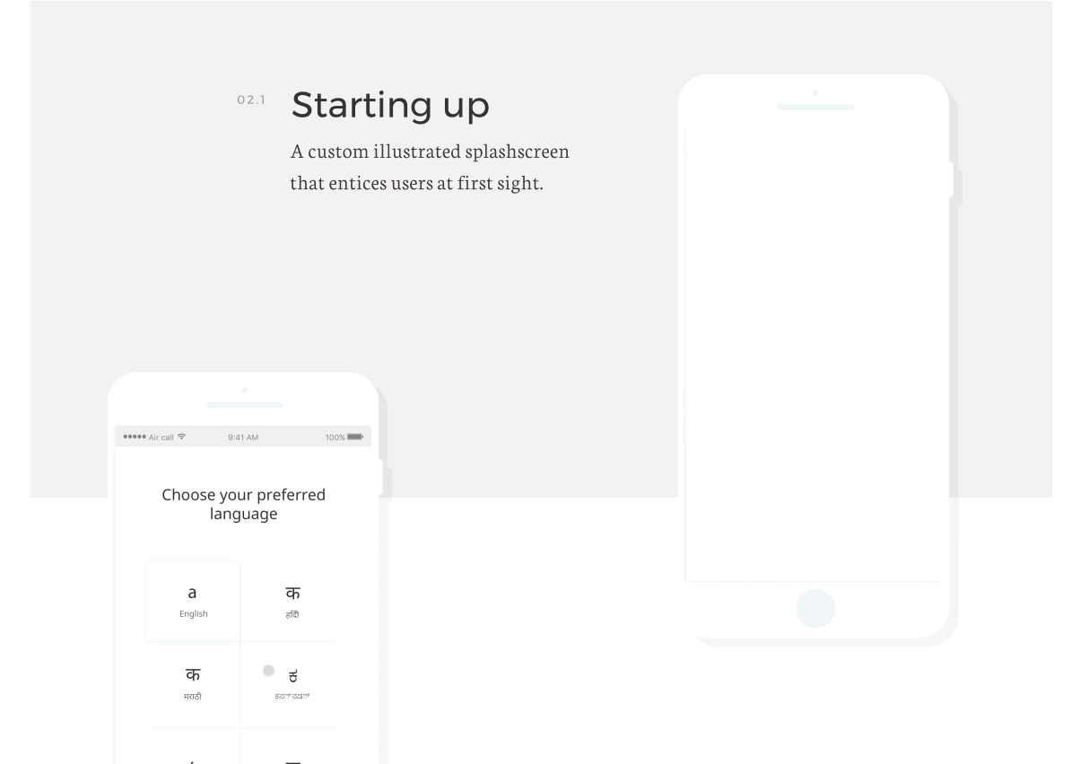
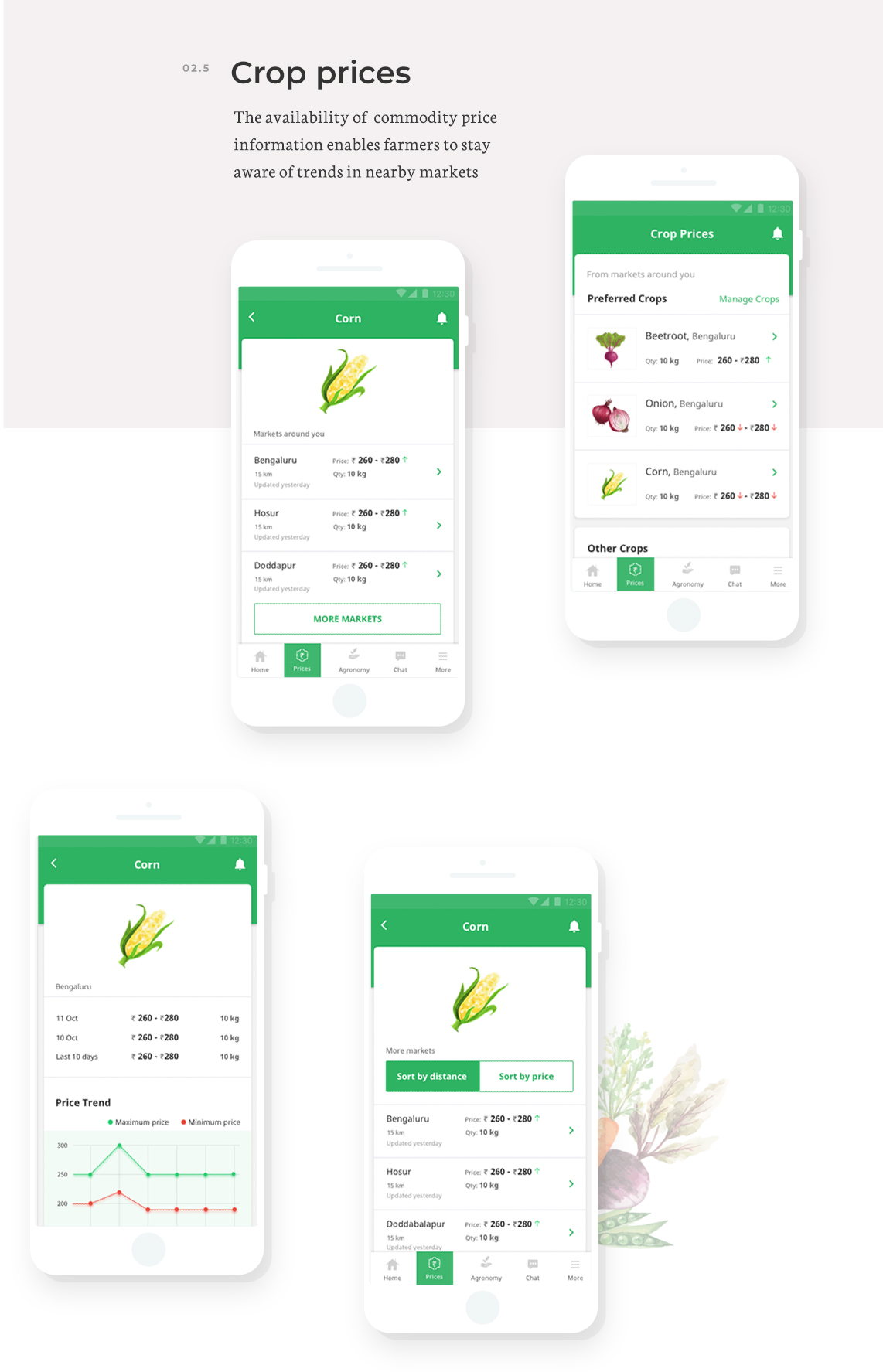
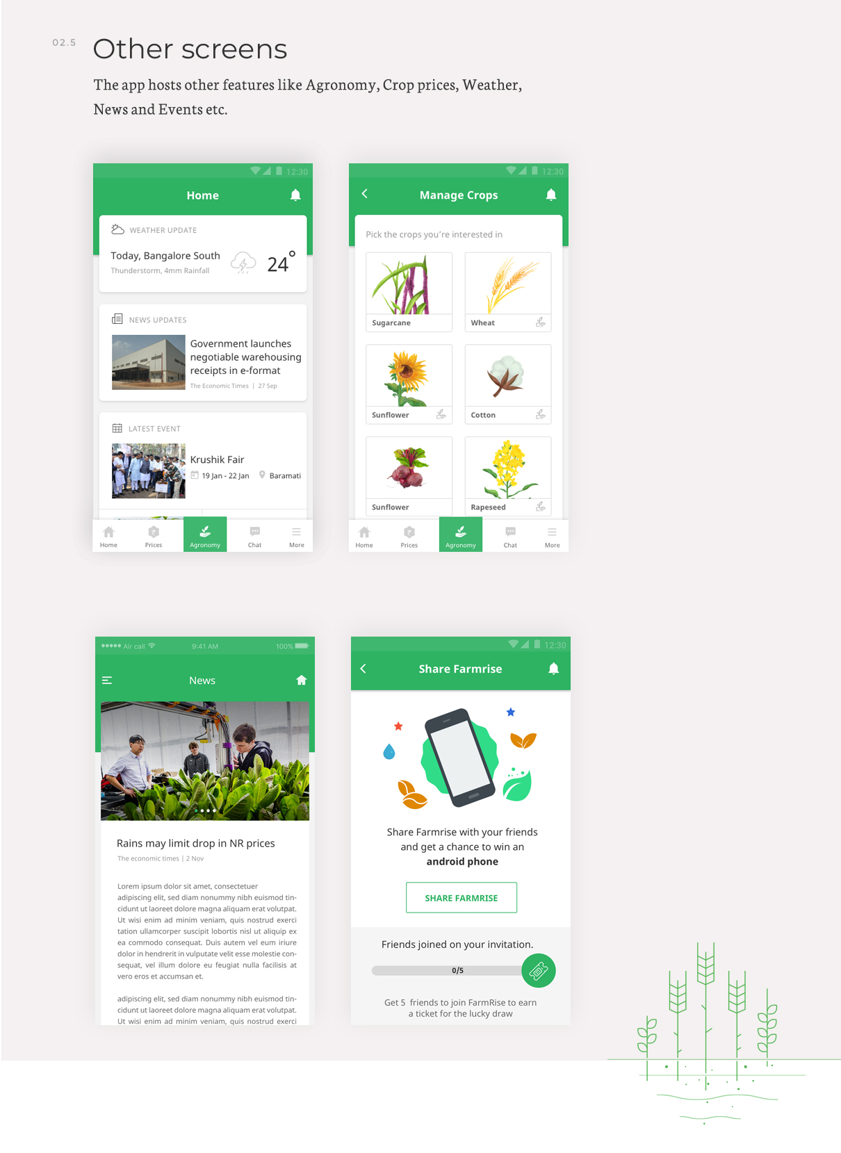
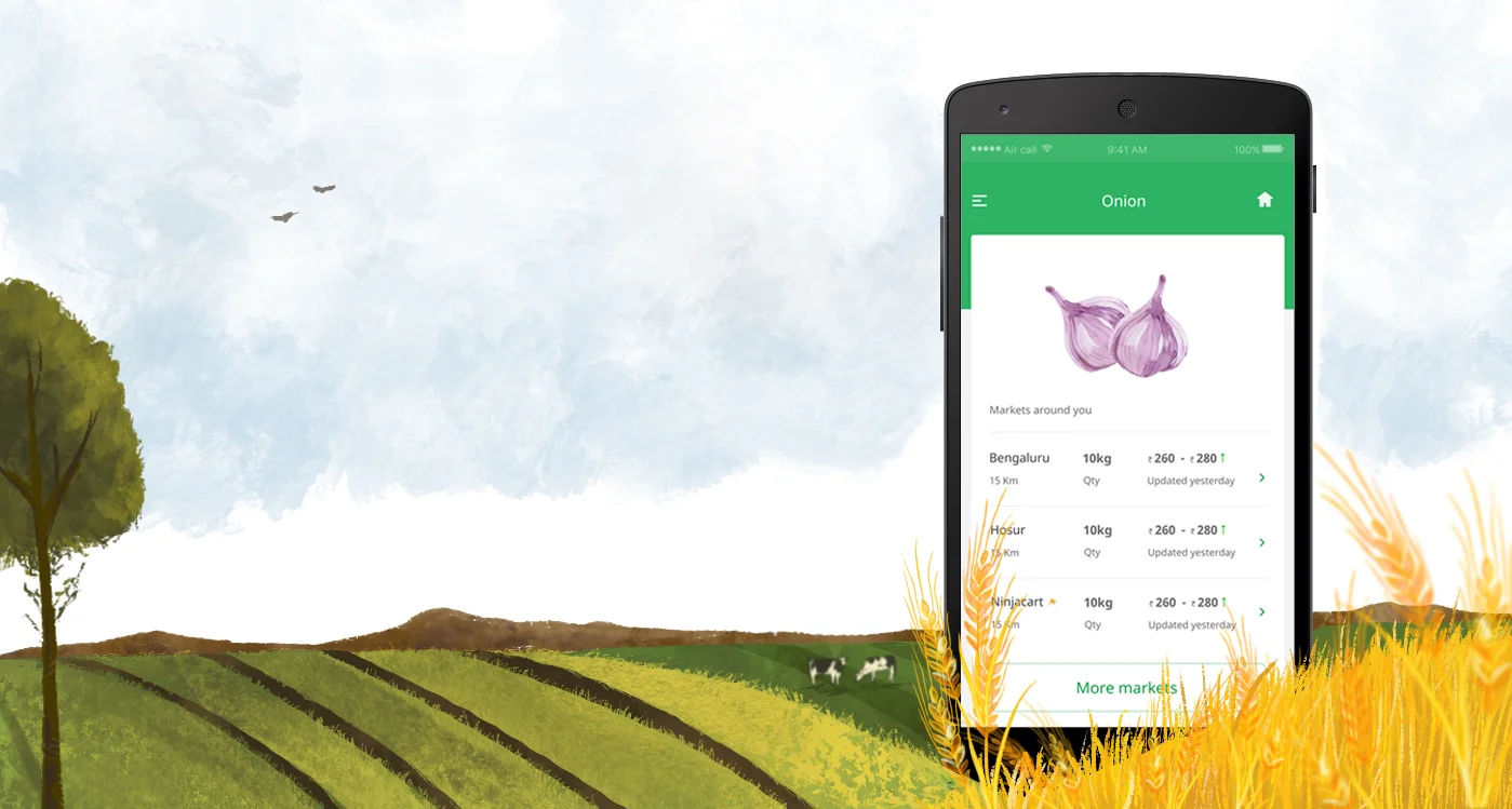
The insights from research clearly directed us in mapping the scope of the project. With our findings, we proposed that it was crucial for the app to be ecosystem-centric product instead of being just a farmer-centric product. Since we were designing for an unconventional audience and for the ones who had experienced internet over their mobiles first; the user orientation, expectation and usage behaviour differed starkly. Also, most of the users were not tech savvy and owned feature phones with low-speed internet. These findings made it very clear that our designs had to be extremely simple and should only incorporate those elements that are a must. Hence, the designed layout is extremely simple and content is the king. Also, we couldn’t make the users spend time and effort searching for what they wanted, so everything was kept up front.
At every point, we have ensured that design does not dictate the content and hence, the visual elements are also scrutinized and thought through at each stage. Every design asset used is clear and concise, such as usage of flat colours or arrows instead of dots etc.
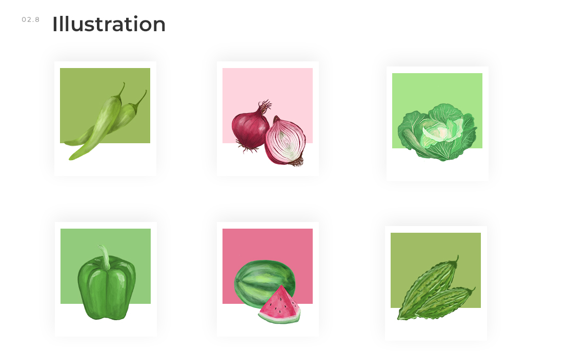
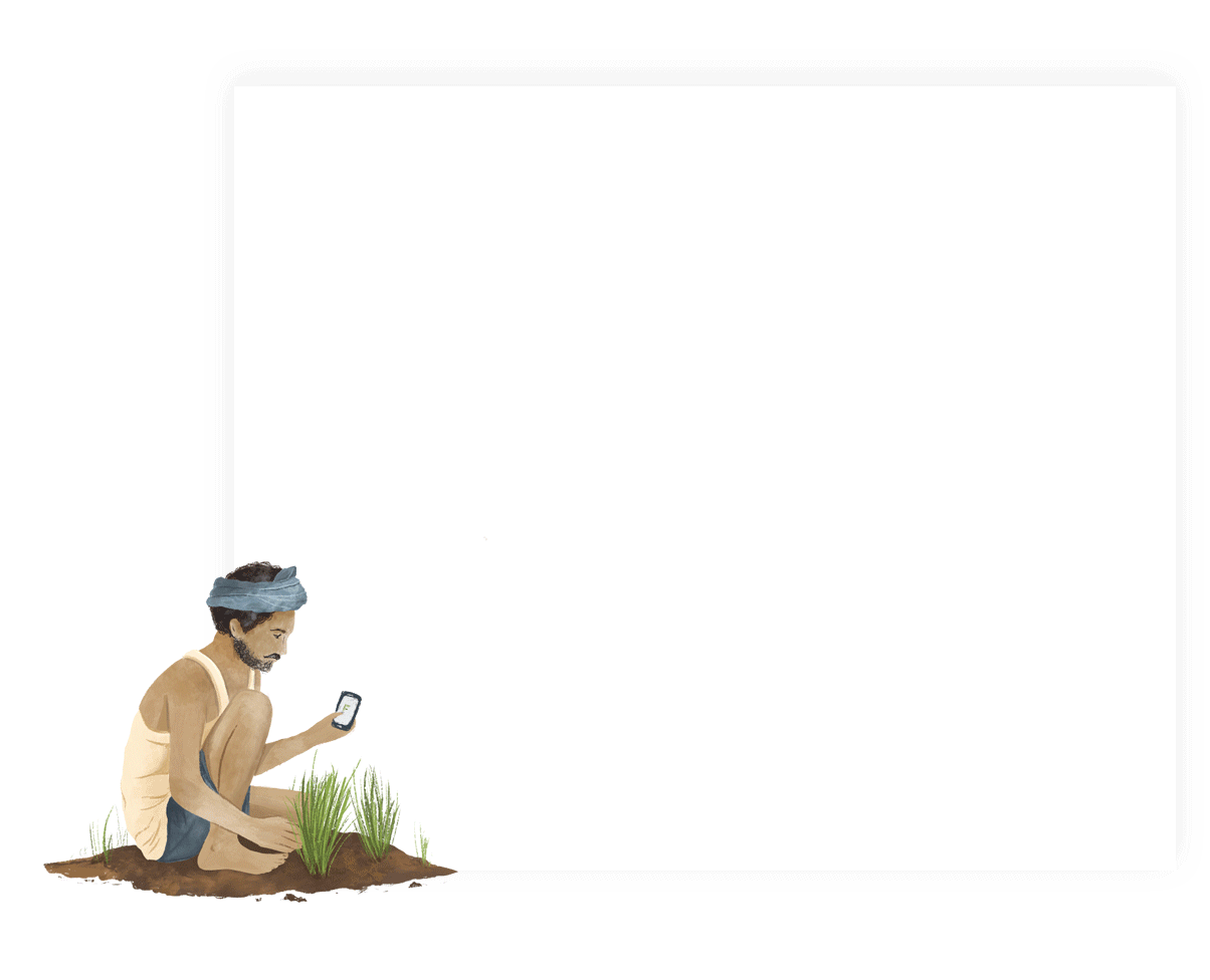
The target audience had a greater inclination towards visuals, but using pictures was not an option as that would make the app heavy and unusable. Hence, we custom designed the lifelike illustrations that resembled water paintings for increased familiarity with the user group. This helped us control the size of the assets and make the app functional even at the lowest internet speed while maintaining the engagement.
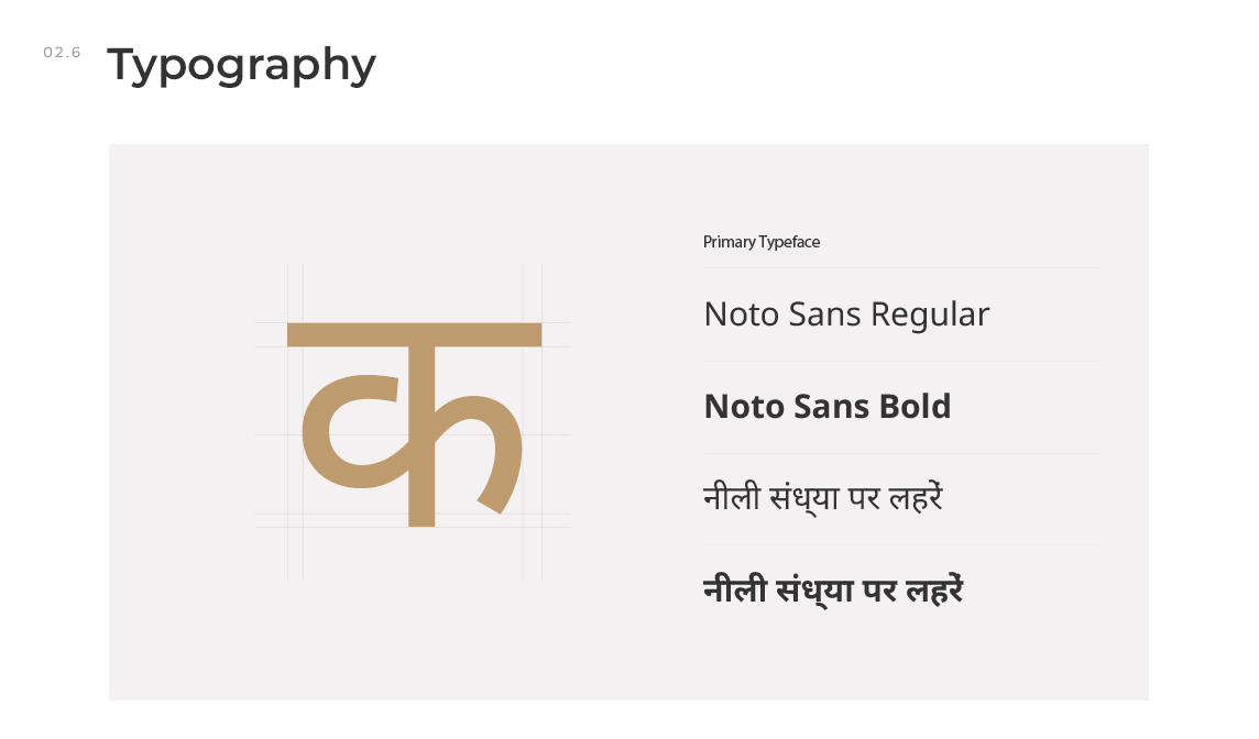
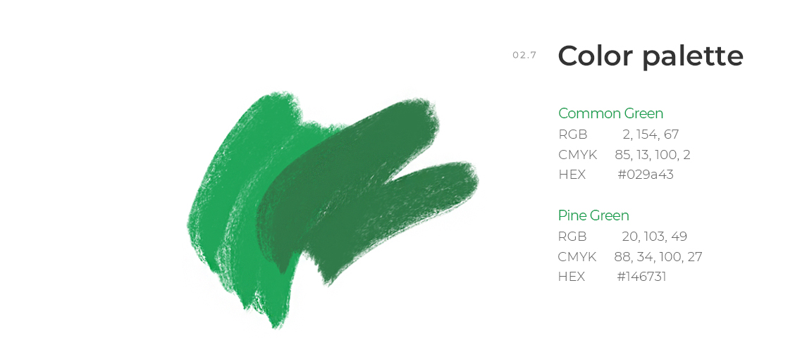
Noto Sans was our go-to font for two reasons; first, it supports multiple languages where the app was to launch and second, being a Google font it was light and would load the fastest. For colours, we stuck to the brand color, green, and played around with ample white spaces.