An immersive and interactive experience to help Deccan Herald improve and proliferate its digital presence.

Designing DH digital presence was extremely challenging as we adopted unified design language to provide the features of scalability and flexibility at all levels to our clients. We had to work backwards, defining each element, variable, style guide and UI elements. Second, we had to test each element with our users as the scope of error was zero.
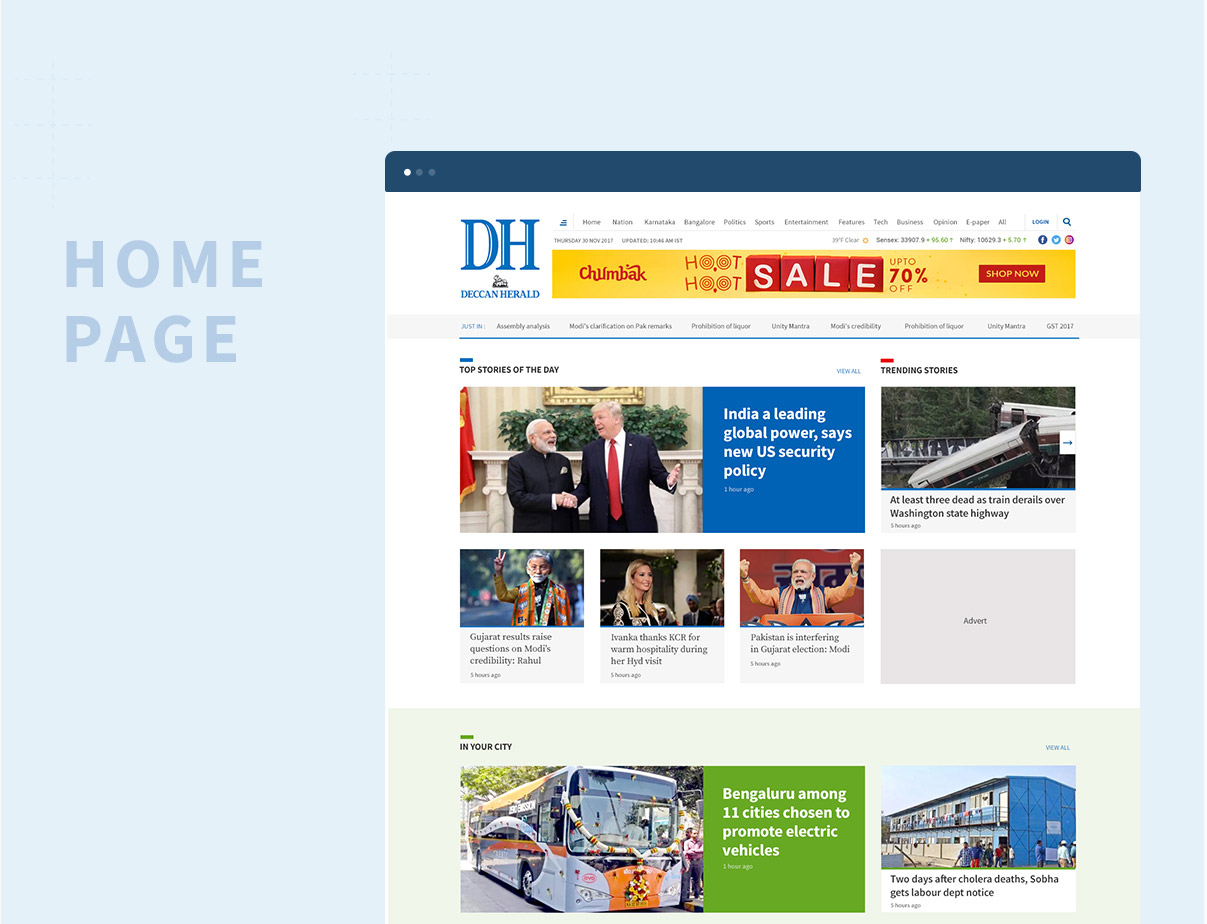
Deccan Herald is an English daily newspaper in the Indian state of Karnataka. It was founded back in 1948 and has been considered among the top 10 most widely read English newspapers in India. It strives to keep itself abreast with the technology keeping users and quality at the center and be a synonymous beacon to Karnataka’s tech aspirations and hence they approached us.
There were multiple focus areas with a singular objective of increased readership and user engagement.We spent close to two months discovering the markets, industry trends, competitors and studying user behavior & preferences.The research provided us with enough insights to craft top 5 personas that would dominate the user ratio on DH platform and we began with in-dept research of their behaviors towards online news portal.
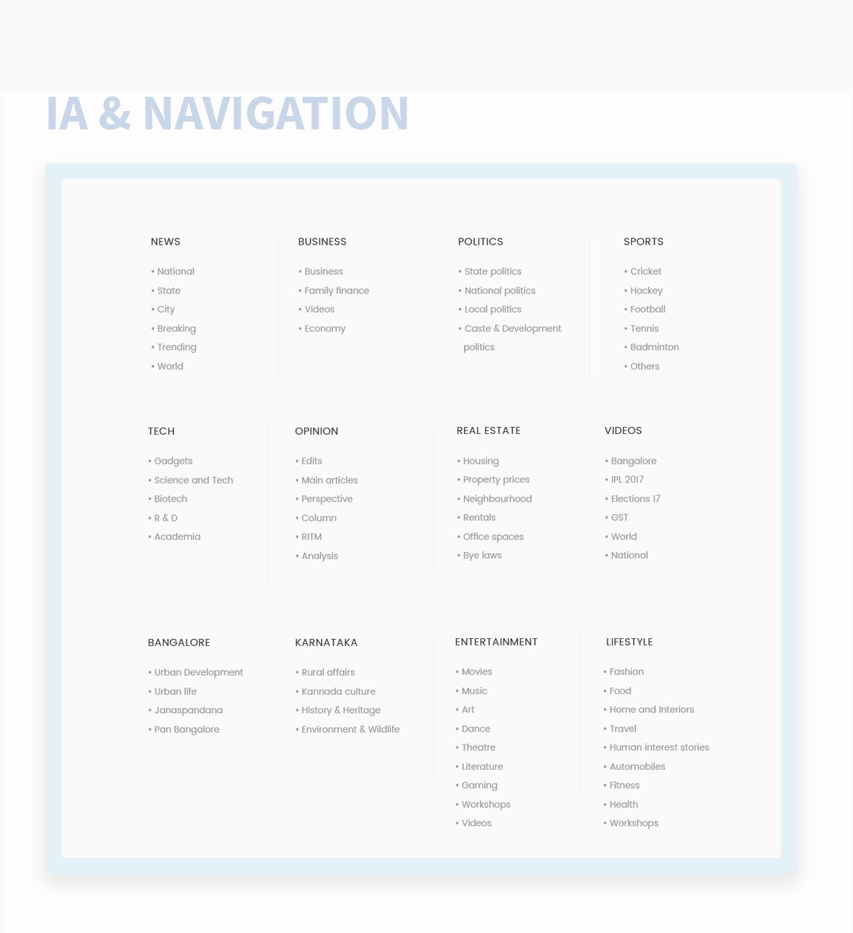
With the help of the research insights and the information provided by DH, we were able to come up with the clusters of news and its classifications. We used the card sorting technique to come up with various navigation options. Each option was then tested on users to observe if they could find the information they were looking for in fraction of seconds.
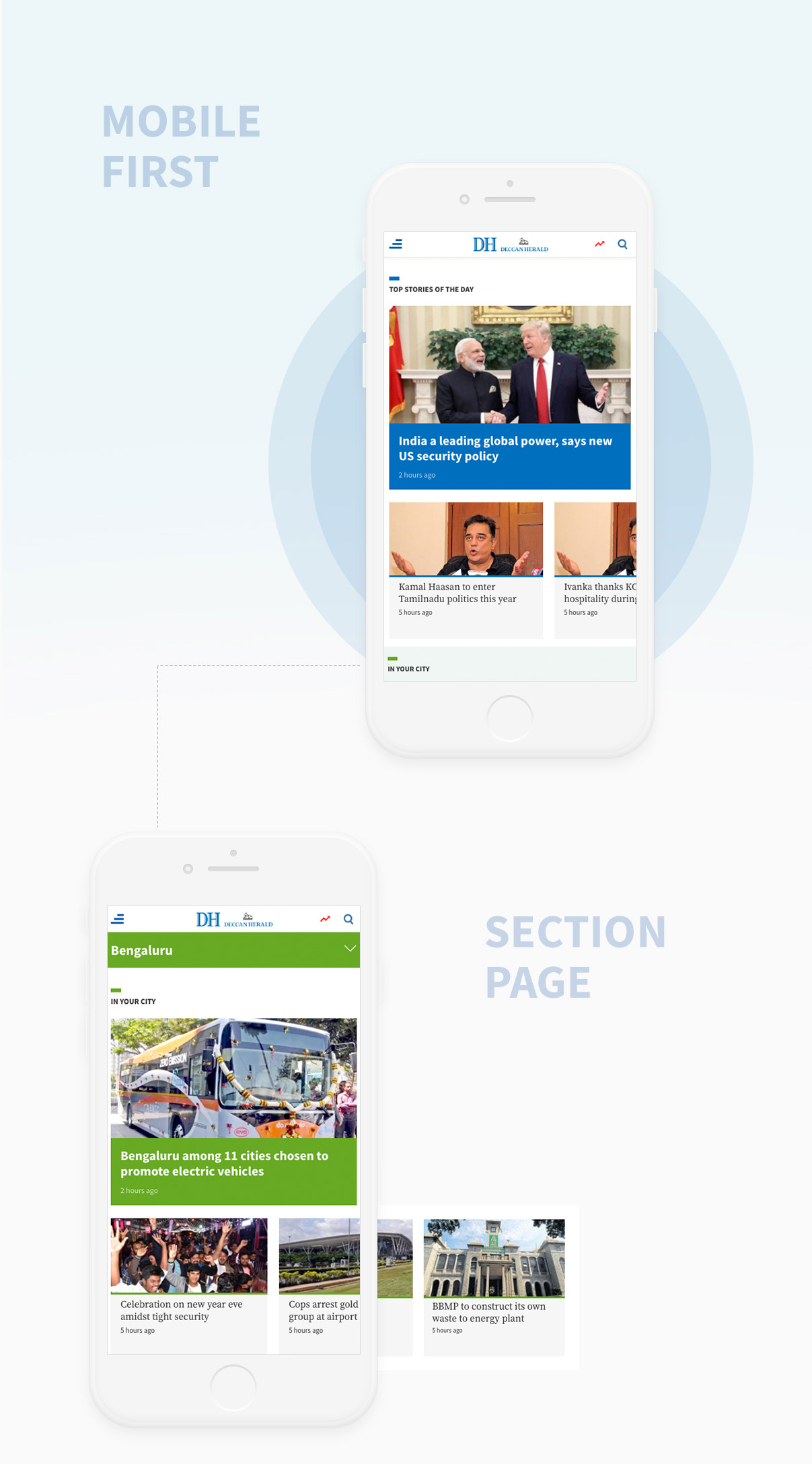
However, design began with the mobile first approach and considered the elements and tasks that user would likely perform when using the responsive website and later extended it to the desktop version.
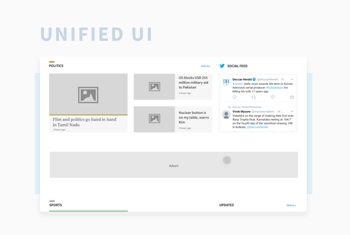
Being a news website, we wanted the user attention to be completely focused on the content and hence we decided against the use of micro-interactions. However, this stage brought in the essential element of Unified UI Design concept out in the open for DH. Since, we wanted to build a scalable design and ensure that the look and feel of the platform always stayed fresh without posing a challenge to the company, we froze upon bringing in the unified design in play.
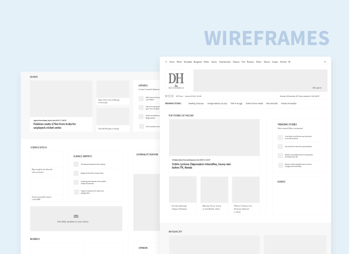
This was extremely challenging as we had to design a complete library of individual design components for implementing the vision of unified design. Fonts, color palette, story cards, widgets and UI elements, each of them have a separate library and do’s and don’ts to provide users with the stunning experience.
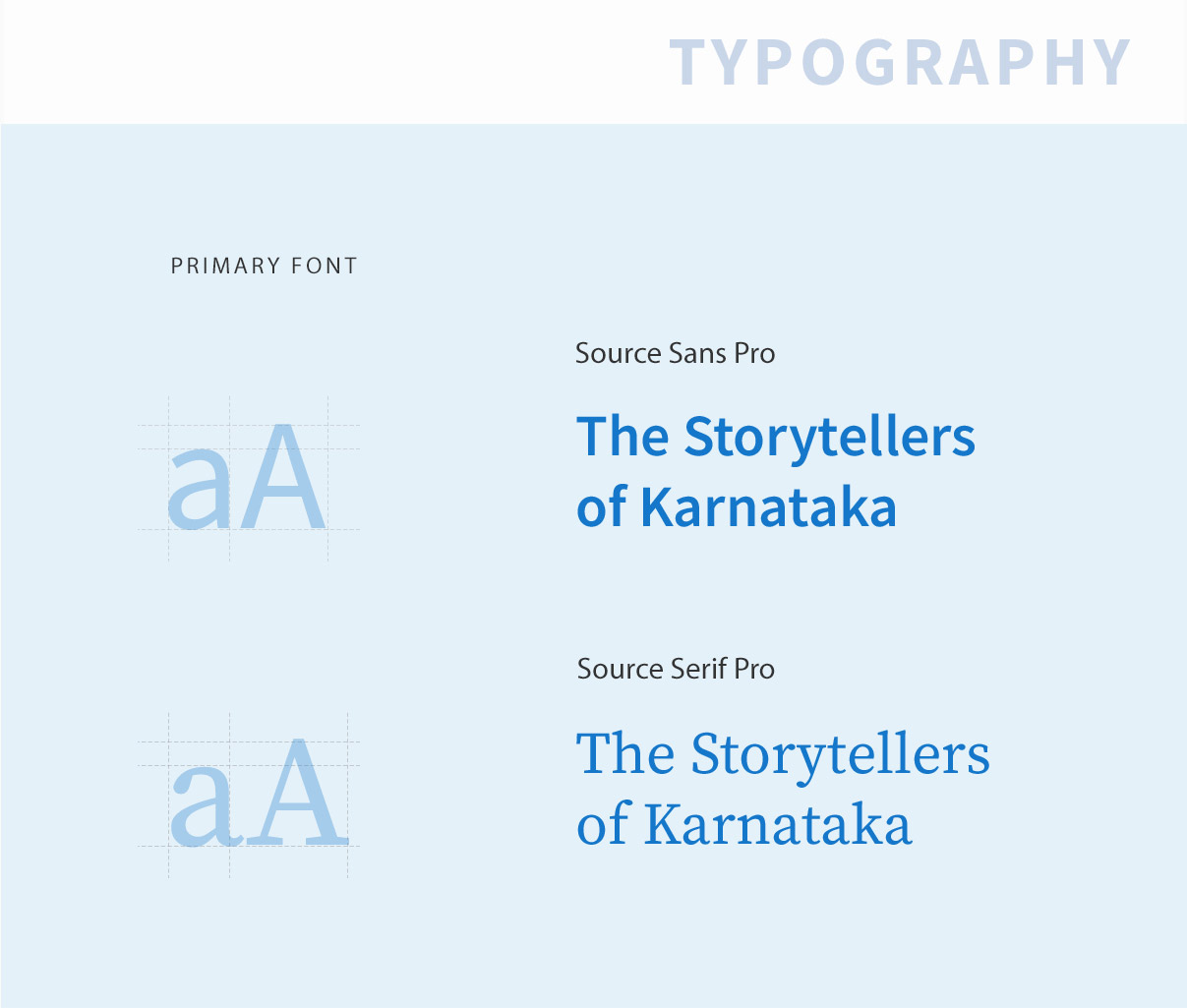
We froze on to the Source Font Family as it was very close to the print version, had variety of serif and sans-serif options and is brilliant when it comes to readability. We defined close to 14 type style that clearly stated the font size, the usage and the font weight.
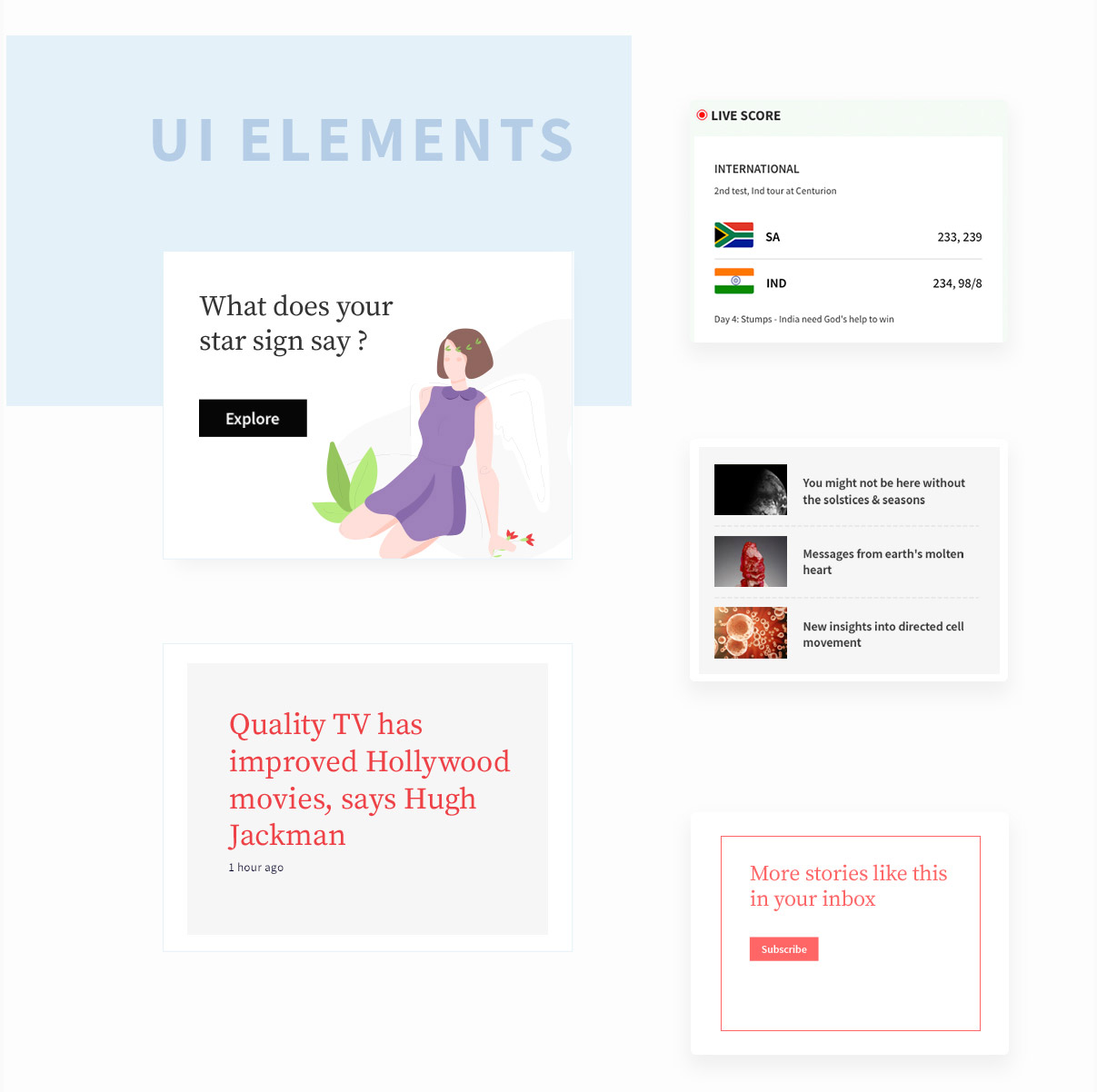
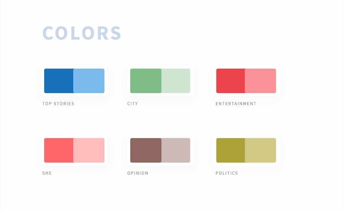
We have worked to provide separate colours for each module and elements. This has been done with the view that in future when DH feels the need to expand and have multiple microsite. Every module has 3 set of colours, viz., primary, secondary, and background colour. Background colour helps in creating separate identity of the section, primary color is used to highlight the news under that section and secondary colour provides the contrast to balance the experience. Close to 21 colour sets were defined based on the data classification.
Complete usability testing was done at every stage. We employed focus groups technique and user observation at each stage.