

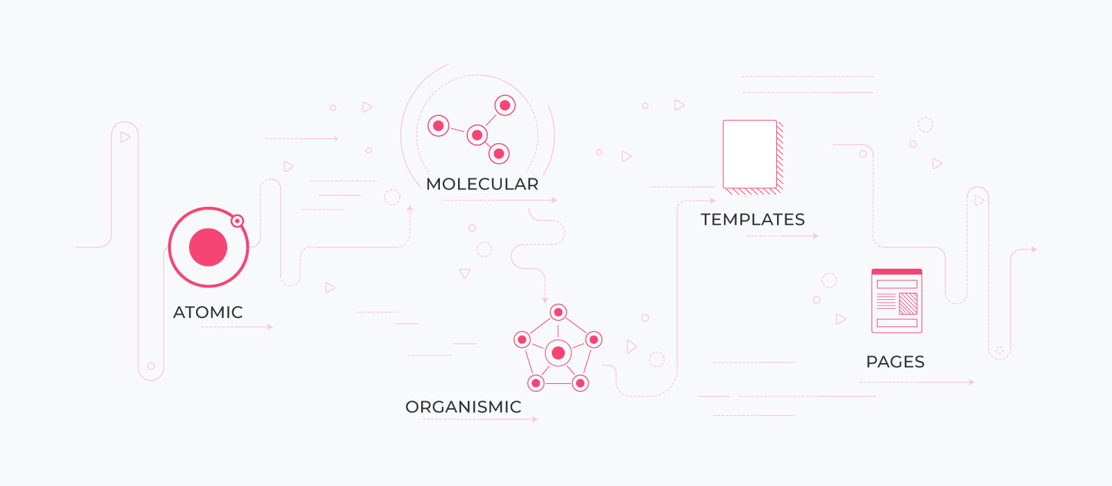
The design system is essentially a library of components guided by a clear set of standards and guidelines and is quite unlike a static style guide that contains spec references. We build the components as we discover the features of products, and continually add them to the library, for future use. This library is reusable so that when similar components are required in the future at different levels – atomic, molecular, organismic, template – they can be reused to build pages quickly and consistently. A design system is always ready to use, yet never complete, leading some to call it a living document.
To create and maintain a design system is to create and maintain a product itself. The design system requires maintenance and updating throughout the life cycle of the product. It is important to make dedicated efforts to design scalable systems, which lead to a seamless consistency across the platform and associated devices. Other benefits include:
Developers can refer to the design system for specifications of the components, which will be similar to their development repository. For a reference to the layout, they can refer to the screens approved, so that they can plug and play with the components to build a new screen, as per the requirement.
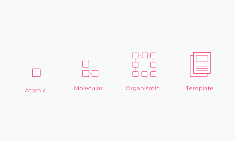
Coined by Brad Frost, Atomic Design is a method wherein the layout of a website is broken down into basic components. these components are then reused throughout the website. The name atomic design comes from the concept of how all matter in the universe can be broken down into a finite set of small elements called atoms. Similarly, it can be applied to creating design systems, wherein our interfaces can be dissected into a finite set of elements. These elements then work together to create effective interface design systems, in a model that is not linear but is mental. It helps us think of the user interfaces as complete entities, as well as of the fact that they were created with the help of collections of parts.
A decade ago, these were known as pattern libraries, before atomic design came in and provided a more comprehensive understanding of design systems. Once Google unveiled Material Design in 2014, the concept of design systems finally matured. Now, after the rise of many such systems, the principle of atomic design is used as a mental model while creating a system to work cohesively with the developer’s repository. To understand more about atomic design, visit: http://atomicdesign.bradfrost.com/.
The use of the design system is truly impressive. It can be used to build a new product, e-commerce website, and so on. As long as you have the team and the time to build and maintain the design system, you can ensure that you will reap the benefits of creating a design system. So what is the process of creating a design system? Given below is a comprehensive, step-by-step process of building design systems with the help of the material theme editor.
A great design system example is the Material Design System, which is Google’s own design system. Also known as material.io, you can find out more on https://material.io/.
1. Start by studying and researching material design guidelines and analyze existing apps that are built using the material design system. This will help you identify and define the purpose of the design system that you wish to create.
2. Download Google’s material design plugin tool for sketching called material theme editor. This is a rather fun plugin because it allows you to change a lot of elements, from colour and typography to icons. The material theme editor makes it easy for one to create an interface because of the organized manner in which elements are arranged and grouped, such that everything is accessible in the form of a dropdown. Moreover, one can customize the theme and save it as a custom one.
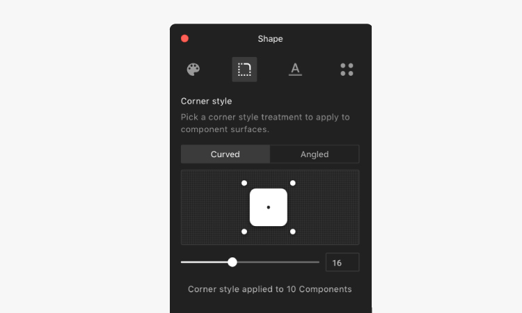
3. Once you have downloaded a material theme from the editor, you will find that all the components are organized as nested symbols, which make it a system on a page called the style guide. These components are reusable, unlike a static guide component, owing to the fact that they are nested and wired with internal connections to the system.
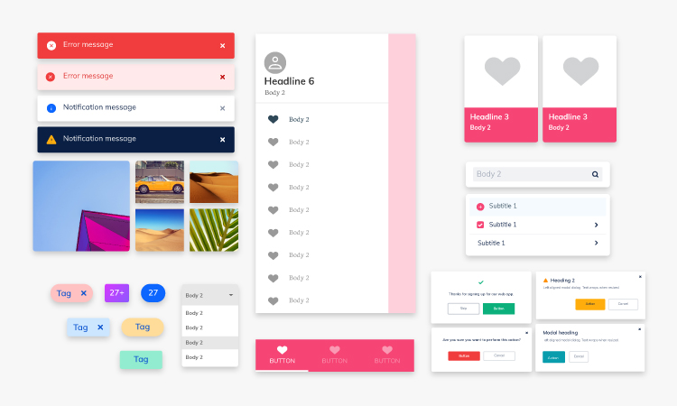
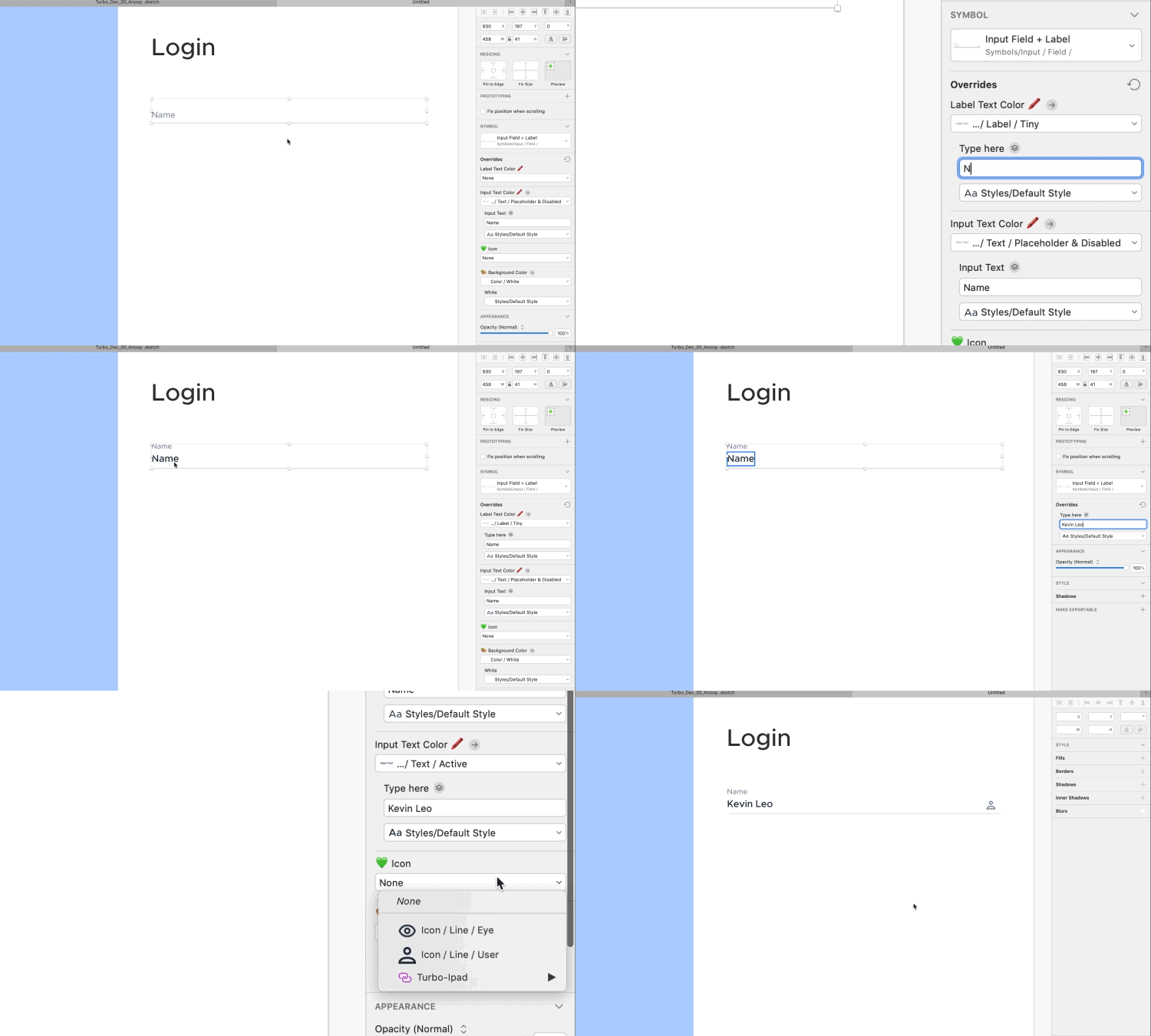
A nested symbol contains multiple symbols within itself in different levels and each of them is wired with different parameters like colours, roundness, highlight state, etc.
This allows the designer to reuse the component and carry out different activities like changing the colour and text on a button, disabling a button, changing an icon, and so on.
All these changes come from within the system as they are wired and structured to be accessible from overrides. This ensures that the design is consistent.
For instance, we can structure the types of FAB having different variants inside it as shown above. While creating symbols, we need to use slash while naming to branch that category for a clean organization.
Here is how you can create a nested symbol in general:
https://medium.com/@Zomerfeld/nested-symbols-in-sketch-i-you-a67d15a35fbc
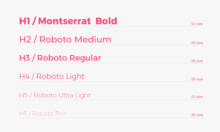
This theme editor also consists of typography scales & weights which can be generated through the plugin. You can choose a desired google font from the editor panel and it automatically generates all the heading sizes and weight according to the font chosen like shown below. Modifications in hierarchy or weight can be made on the canvas/document of the style guide.
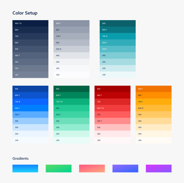
Throughout the panel, we can change the primary & secondary colours to the desired brand colour and every element in the style guide and components will be replaced with the new brand colours automatically. That’s the magic of using nested and wired components. So far, the theme editor allows two colours We can add more in the document of the style guide, but that does not reflect back on the panel yet.
Material design provides you with 4 types of system icon sets, which are filled, sharp, rounded and two-toned. Like other things, we can add more to this library with our custom icons as well.
![]()
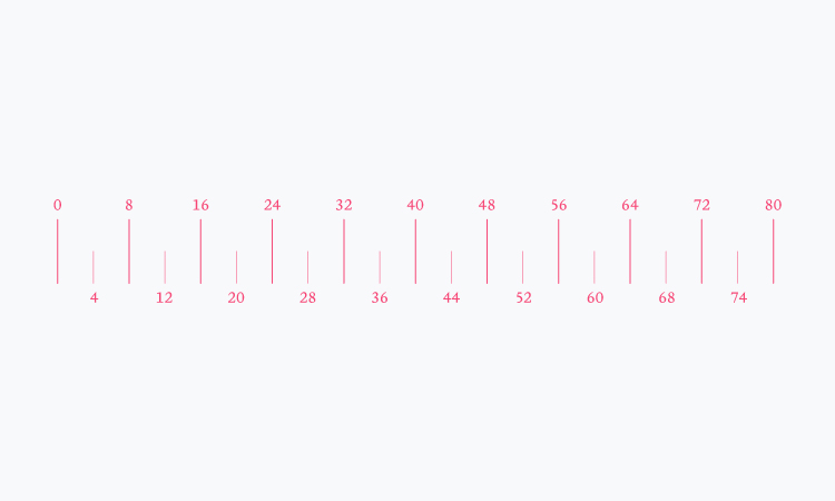
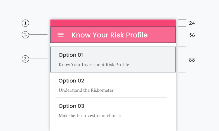
Material design uses an 8 point grid system. This means that no matter what framework you build, it uses a basic measurable unit of 8 and multiple of 8, to maintain balance while designing for all platforms. Because all the devices we design for have screen widths divisible by 8, this grid system has gradually become very popular in the industry. Check out for more info:
https://material.io/design/layout/spacing-methods.html#
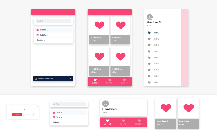
Material design provides some screen templates built using atoms (first level symbol) and molecules (nested symbols).
Not all the icons that the material system gives might suffice for one’s design. Sometimes we have to create some custom icons either for customisation or the sake of context. So how do we add icons to the system, without collapsing its structure and make it as accessible as other system icons? How do we add a typographic size/weight or add a color code to the color system? Let’s take a quick look.
![]()
Every icon is named in a specific way, such that they are grouped and named for designing easily. Example: Icon/Menu/Filled, Icon/Menu/Sharp etc.. so that under Icons, you can find a variety of other icons like that of a Menu, and under that, you can find its variants like Sharp, Filled etc.
To set up the colour for an icon to be wired with the colour system, the icon symbol is structured in such a way that the shape of the icon behaves as a mask for the colour symbol layered on top of it.
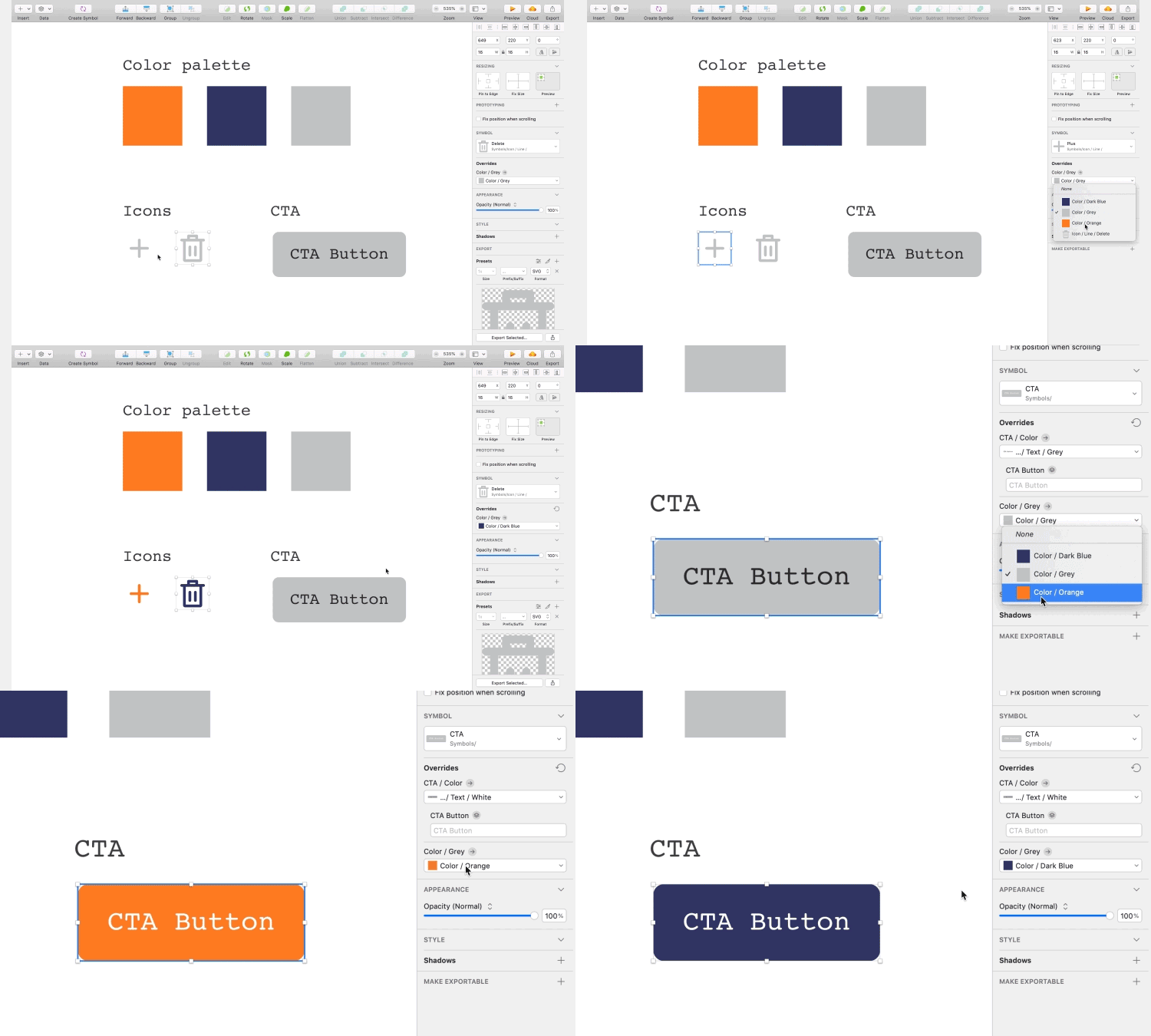
This way an icon is wired with the colour system and other icons, so long as the colour system is also in place. The user can now change the icon glyph/shape from the symbols dropdown and change the colour from the overrides. To add to the icon system, go to the symbols page and duplicate an icon symbol that already has an appropriate structure and just replace the icon glyph/shape with the new one and make sure you change the artboard/symbol name to the new one. Voila!
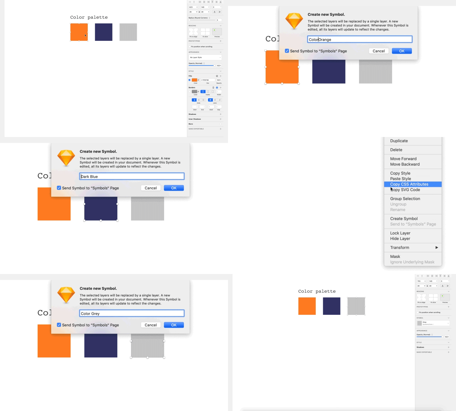
There are two ways to create a colour system from scratch. Create colour swatches of the shades and tints of a colour, and name them correctly like colour/blue/blue100; colour/blue/blue 900, etc. Then, convert these swatches into symbols. This is an essential step. Additionally, create a layer style for colours. Select the colour swatch shapes and create a layer style, and name it similarly as mentioned above. This gives you more flexibility to access colour from the system. (show a gif) If you want to add a colour to the system, the symbol or layer style can be duplicated to modify and rename it.
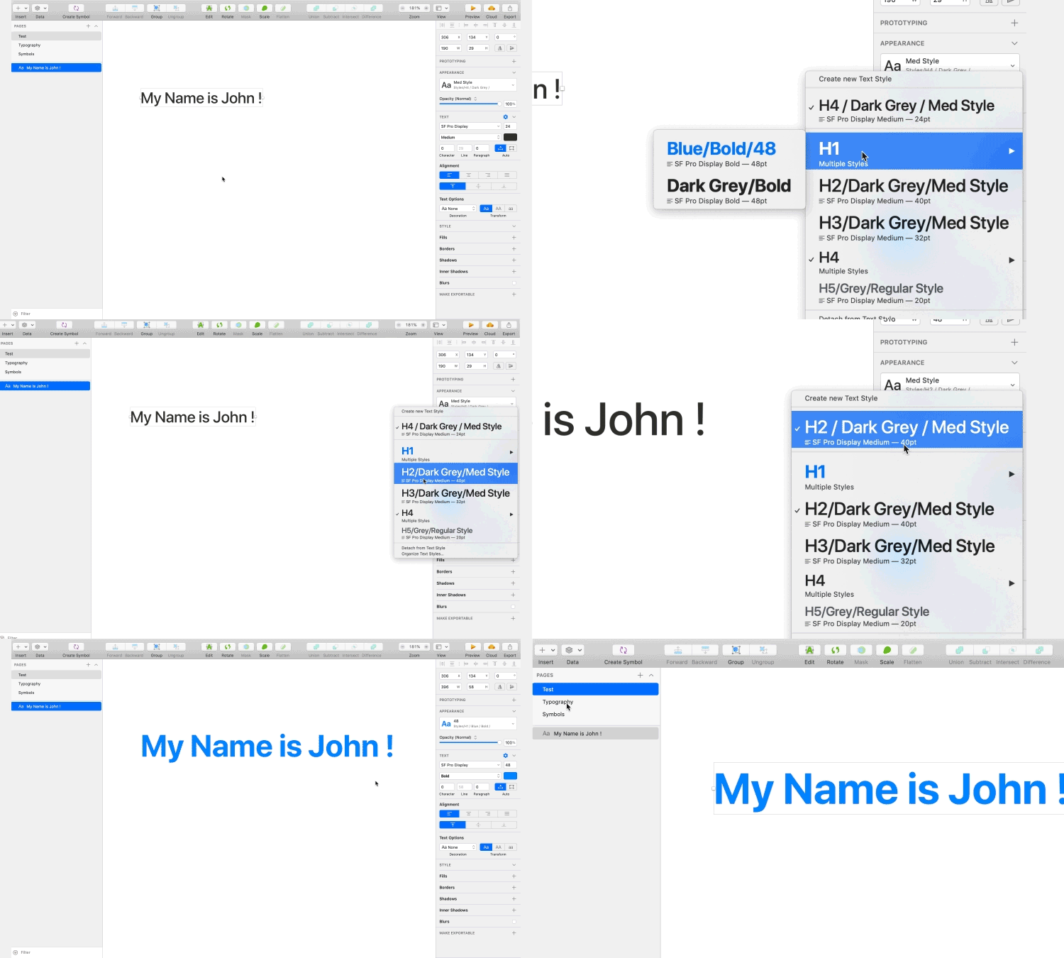
Similar to the colour system, we can create typography with a particular scale and weight that is appropriate for a heading or text link or body copy and create either a new layer style or new symbol for reusability. To add a new typographic scale, we can duplicate an existing style, modify and rename it.
Now that you have a base system set up for your brand and requirements, you can get started with building screens by plugging and playing the components/colours/typography from the system.
1. You could start with creating separate elements like the navigation bar(Top bar), bottom bar, unit trays, etc., with different variations and colour options available in the system.
2. You could send in your system and the first round of screens to your client or team. Once approved, you can start to re-use those components with over-rides.
3. If needed, create new components/styles/typographic scale or modify the existing ones in the system as per the feedback, but only with the approval from the team. Your system is now scalable without breaking the consistency.
4. If there are multiple designers in your team, you can use the “sketch library” feature so that everyone is in sync with one source of truth. This means you will have a master system file which will be stored in the cloud, like on Dropbox or Google Drive. This file will be a read-only file, and all the designers in the team can access the master file from there, so that whenever there needs to be an update or addition to the system, you could carry it out on the master file, with approval from the team. The change will reflect in everybody’s sketch files as a downloadable update. In this manner, controlling the sketches and their various versions becomes easy and organized.
5. You can give read-only access to the master file of a system to your developers so that they can read the specifications of atoms, molecules and organisms from there and build their repository. For layout reference, you can hand-off your screens to them. The developers can then refer to the layouts and build the screens using the repository they have built on their code system. This way we are always designing for practical end-results and are in sync with developers’ processes.
System design and development is a handy tool for designers! Following the above guidelines, you can create a design system that allows you to access a library of components as and when you require it so that you can use and modify previously created components to create new components with the help of reference points. If you know of any other ways to create design systems, leave a comment below!
We would like to thank Dhilip Kumar for contributing immensely in shaping this article.
