

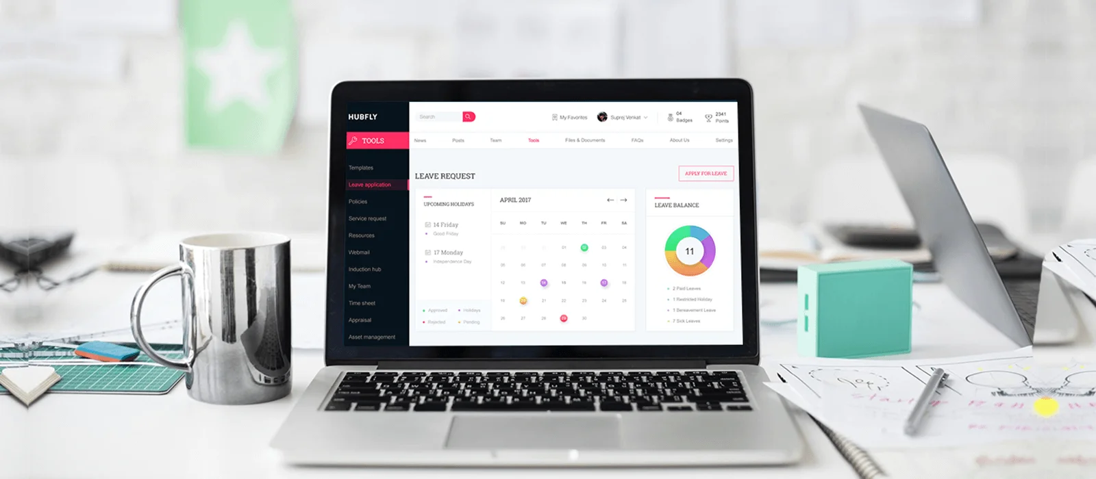

The technical age we live in today is evolving each day with various brilliant technologies such as Artificial Intelligence (AI), Business Intelligence, and BlockChain, which are becoming an inevitable part of our daily lives. These smart technologies use complex algorithms to quickly analyze tons of data, and present users with useful information. But, what’s the point of data or information, if the user cannot understand or relate to it? Or worse, what if they are unable to find it useful or benefit from it? This is the very reason to why dashboard designs have recently gained a lot of importance.
In one of our previous blogs, ‘Seven pro tips to nail dashboard design‘, we discussed the functional, A.K.A, the UX side of the dashboard design. This piece, on the other hand, is about the visual design of a dashboard, as UI of a dashboard is equally important in order to make it usable and fun. However, before we delve into how to make dashboards look their very best, here is a quick recap of essential features of a great dashboard:
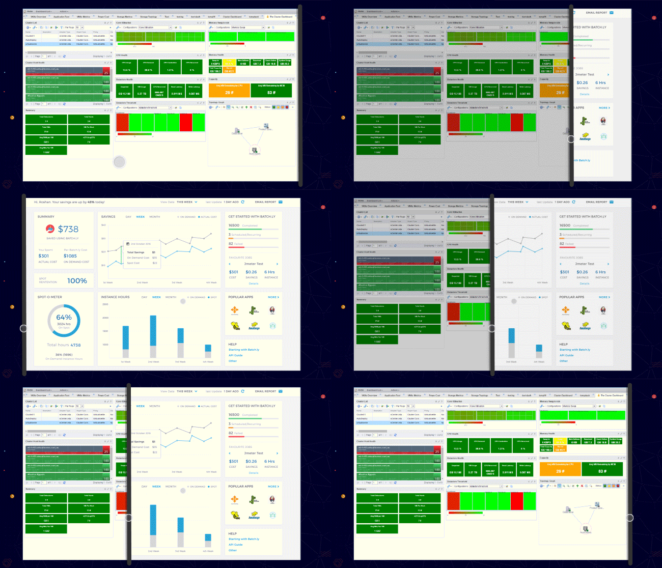
When it comes to a dashboard, it’s important to remain consistent in terms of visual design, throughout. An undeviating design on all devices is what we are talking about. Most users own multiple devices that have varying screen sizes, such as smartphones, tablets, and desktops, and hence, it’s extremely important to ensure that the dashboard is consistent in terms of the way it looks and functions on each of these devices, whether it’s in terms of colors, fonts, placement of elements, navigation, or even the style of charts. It’s advisable to follow the golden rule of design by starting with the smallest screen first, as this helps in creating visually appealing spaces for the most important information first and leads towards creating the perfect user interface design that enhances the abilities of a great UX, as well.
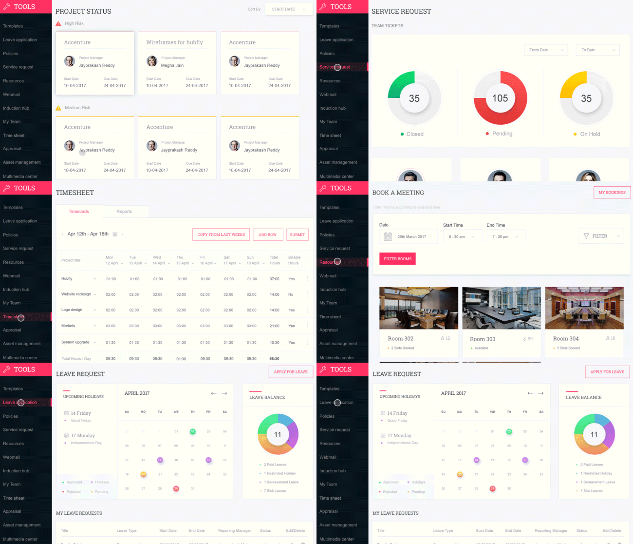
Content hierarchy is the heart and soul of designing a dashboard but is something that is achieved during the UX stage of dashboard design. However, It is only through visual design, that the most vital information can be conveyed to users in an appealing and usable manner. This stage not only helps in freezing the layout but also helps define the design guidelines.
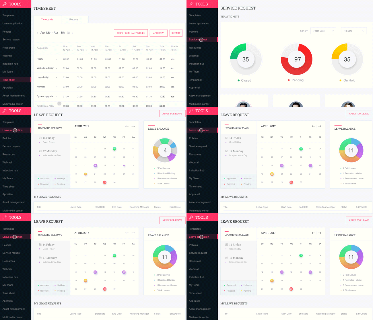
While designing a dashboard it’s important not to take a “one size fits all” approach. This is because firstly, we have multiple user roles with varying needs and priorities; and secondly, designs should be scalable. It’s really important to focus on empowering users with designs that they can adjust to fit their individual business needs– this could be as simple adding or deleting a column, or as complex as adding a whole new module.
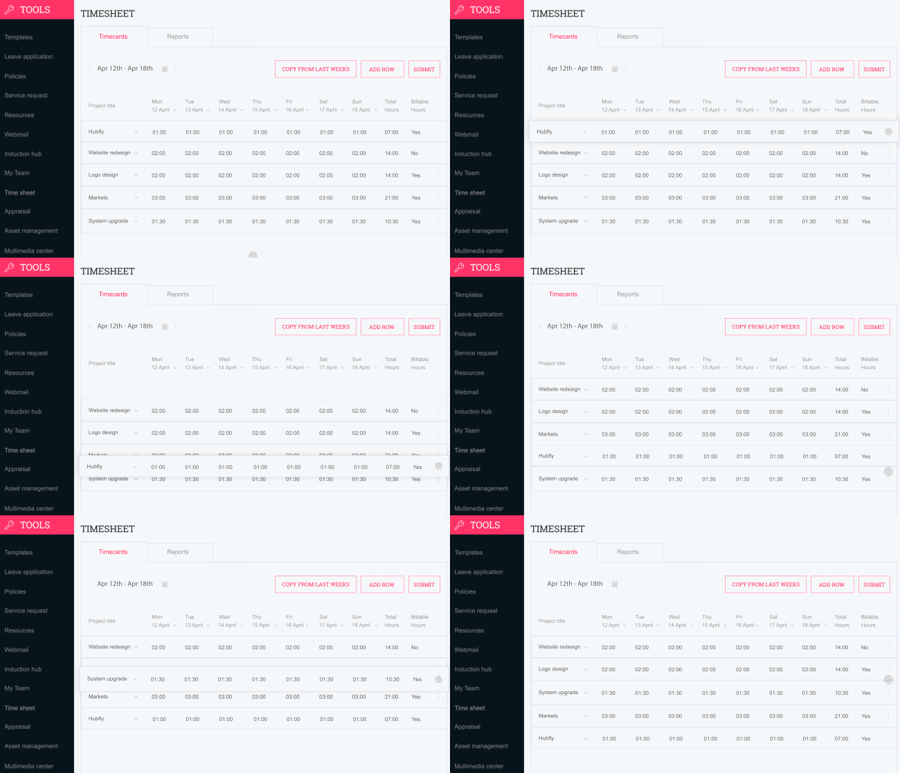
Basically, no matter what the complexity is, good dashboard design should always allow for easy customization.
As designers, we generally get very excited by the varieties of ideas of presenting data differently, which tends to make us go overboard. But, charts are the primary data visualization tool for users and they should be simple– fancy, complicated charts should be avoided.
Generally ignored, but a very vital component of a dashboard UI is icons. The best dashboard designs include icons that are familiar. For instance, a trash can symbolizes ‘delete’ and everyone can easily recognize its function. Dashboards are probably used multiple times a day by users and are accessed for quick action or information. Hence, obvious signifiers reduce the processing time and help create great UX and UI.
Both, the style of the font and its size are equally important when it comes to UX and UI. While designing a dashboard, it’s advisable to use not more than two font styles for cleaner UI design.
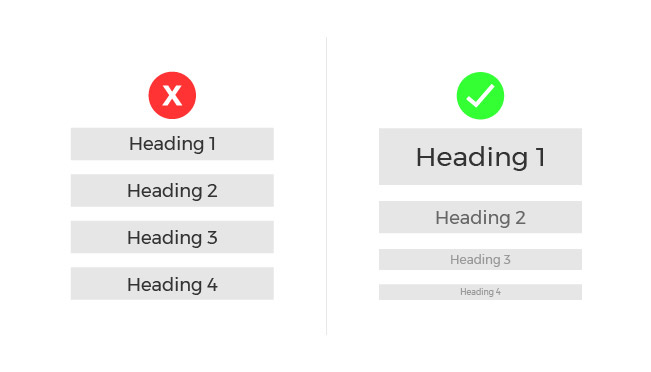
Creating a visual hierarchy (in the inverted pyramid style) with all the written content present on the dashboard is very important. You can do this by putting the most important insights in the largest font and probably in a distinctive color, and put the not-so-important information in a smaller font size.
Different colors denote different things. Think about a traffic light. The red light requires us to stop, and the green means we can continue driving. Now, imagine having a green light that requires us to stop, and a red light that conveys we can keep on driving. Wouldn’t that be really confusing? This is why, in order to achieve a good dashboard UI, it’s extremely important to be mindful of the colors used in the dashboard design.
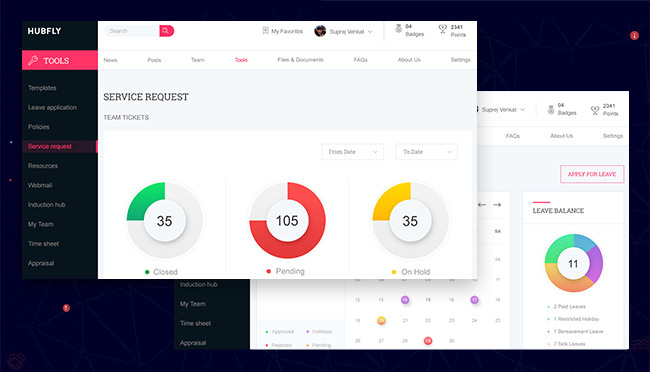
Besides using the right colors, it’s important to keep in mind not to go overboard with the colors used. In order to use color correctly for a dashboard, it’s vital to leverage contrast. You could start by using just two colors that match well, such as complementary colors.
The aforementioned tips will surely help in creating a better dashboard UI design, but they’re worthless if you don’t know the user. If you know your users’ preferences well, you will be able to determine what kind of style needs to be employed on a dashboard. Furthermore, it would help to precisely tailor the designs according to the specific needs of your audience, which in turn will make them find the dashboard useful.
Imagine designing a corporate-looking dashboard for children! It would surely make them wary of the dashboard, wouldn’t it? And imagine a dashboard for businessmen that has the Looney Toons all over it – it’ll obviously lose every ounce of seriousness that it’s supposed to have. That’s why, even in visual design, knowing the user is of utmost importance. For an in-depth understanding of employing research techniques, you could check out our blog on ‘User Research’.
“People ignore designs that ignore people”
