

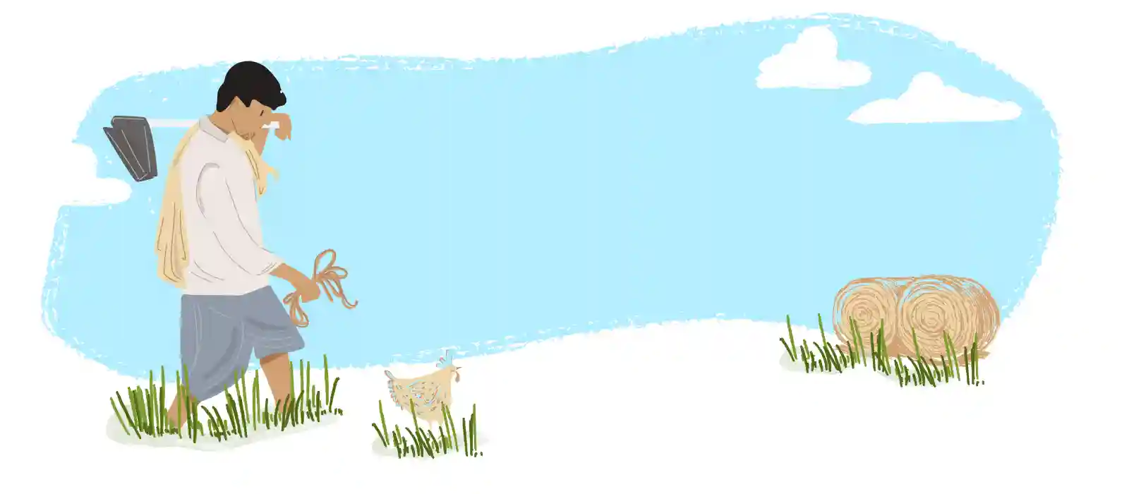

Very recently, I designed a mAgri application, which turned out to be one of the most thrilling design experiences of my career. What excites me about this app is its potential of positively impacting lives of many farmers, who form a whopping 58% of the Indian population. The Android application aims at empowering the Indian farming community by helping them optimize their resources, maximize their yields and profits by utilizing the features and information the app provides.
In order to create such an app, a good amount of research was required. We spent close to 2 months on the field with farmers, learning their lifestyle, thought processes, and their needs. This helped us deduce an optimal design strategy that would increase the onboarding and retainment of this app. To know more about how we conducted the research, you could check out our blog on interviewing farmers.
From the research findings obtained, it was clear that the mAgri app was intended for an unconventional audience. Below are few crucial things we learnt during our design journey, and we sincerely hope that everyone in the field of agriculture or design benefits from this.
The preliminary research showed that Indian farmers do not possess smartphones that are extremely advanced. Moreover, the farmers, who belonged to a higher age group, weren’t the most tech-savvy. And so, we were definite that the mAgri app had to be extremely simple like Google feed, which is why we had to make sure the design did not dictate the content. It was also important to ensure that everything was upfront— we couldn’t make the users spend time and effort searching for what they wanted. For instance, we could not use a hamburger menu that would hide information.
Finally, we learned that it was important to revisit the fact that the target group’s orientation toward functionalities on mobile devices was extremely limited and hence, every feature of the app was made very obvious. The idea here was to keep the user, AKA, Indian farmers informed at every stage and drive their confidence simultaneously. And so, we had to make sure that the design was there to guide the users, and not overwhelm them.
The motive was to ensure that farmers found it easy to use the app in the first place because it was only if they enjoyed their first experience of the app, would the mAgri product truly stand a chance.
Most Indian farmers use data that’s either 2G or low-speed 3G. Therefore, it was necessary for us to make sure that the mAgri app was extremely light, and loaded fast. In order to do this, we aimed at keeping all design assets under 10KB.
Generally, the farmers would use this app while out on the field (where there’s a lot of sunlight), and so, it was necessary to make sure the design had enough contrast, so as to improve readability. And so, we avoided using more than two colors.
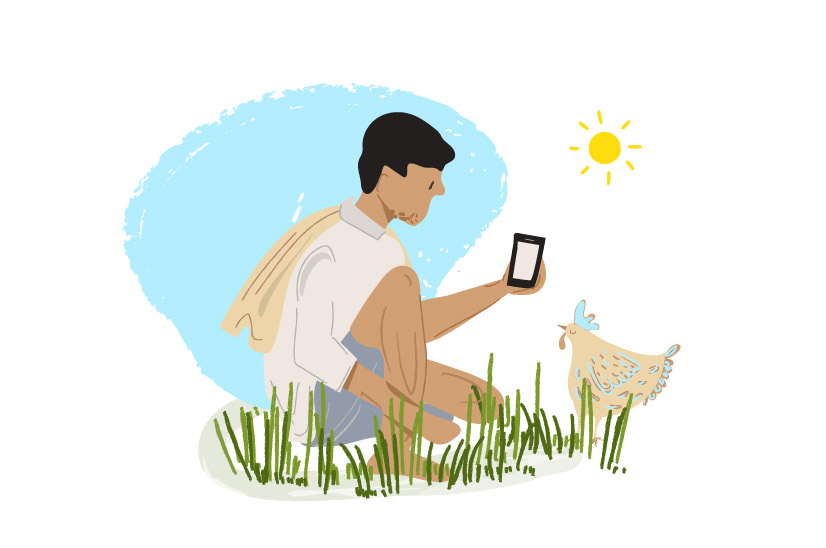
In our designs, we’ve used only green, which is the brand color, and played around with a lot of white space. This was done for two simple reasons: one, to ensure that the focus at all times was on the content; and two, this was one of the best ways to keep the weight of the assets light. In addition to this, all design elements were clear and concise. For example, we used strokes instead of drop shadows, and flat colors instead of gradients.
A major share of the contribution to India’s magnanimous agriculture sector comes from 9 Indian states. And with every border, the culture and language changes in India.
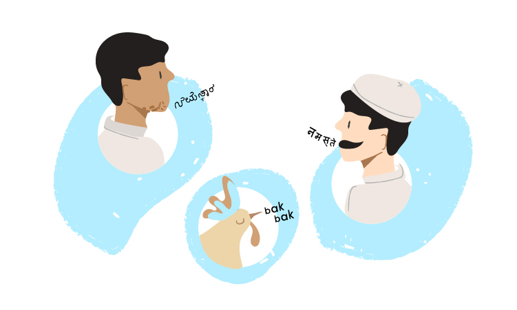
Since our app is meant for farmers all over India, who speak a variety of languages, the app needed to be personalized in those languages. We went ahead with Noto Sans, a font that was designed by Google for a couple of reasons. First, it suits a variety of languages, right from Marathi, and Hindi, to Gujarati and Kannada. Second, being a Google font, Noto Sans loads extremely fast, thereby reducing the server wait time.
Another important thing to keep in mind was that the font needed to be legible, and have optimal readability. And so, the font size we used for the app was 32 px.
We were at the crux of conflict here– a limited internet speed, made it vital to keep the assets light, but our target audience had a low orientation towards reading, which required us to make our app visual-heavy. While devising the strategy, we decided to create a lot of life-like illustrations as our target audience could easily relate to them, and this also gave us the freedom to control the size of the assets. Our illustrations have watercolour effects that resemble hand-painted images. These turned out to work wonders with our audience.
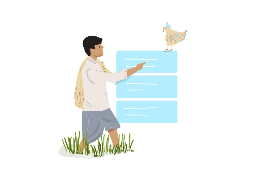
From our research, we found that our target audience was familiar with Google and YouTube. We realized it was a good idea to style the product around apps they frequently use and try to match the usability accordingly. Thus, we went with a card style layout for the mAgri app— a layout that’s very similar to Google Feed. This helped keep the content upfront so that the farmers were able to associate with the app instantaneously.
Each and every one of the aforementioned points contributes to this particular point. However, let’s reiterate this, taking the target audience into consideration.
For mAgri apps, it’s extremely important to be very conscious of choices of elements, as well as the size of those elements. For instance, we found that the farmers didn’t understand concepts such as an image carousel— they didn’t understand the dots at the bottom. And so, we had to change the dots to arrows. Another example would be the color of the bottom navigation. At first, we used green. However, the farmers didn’t identify this as something clickable, and so, we had to change this to white. Even when it came to error messages, the error messages had to spell out exactly why an error was happening, so that the farmers were not left confused.
We can’t stress enough on how important testing a mAgri app is. This is because our thought processes and tech understanding is extremely different from that of the users. And so, it’s advisable to do the testing with all the elements and the colours. The example of the change in navigation was an outcome of usability testing.

Creating this app taught us the criticality of every little detail. As designers, it instilled us with the awareness of how much responsibility we own towards empowering lives of many. The app will be out in the market very soon, and we hope you’ll give it a try— so do keep your eyes peeled for it. After all, your feedback is always of utmost value.
