

We evolve with time. We learn from the various experiences we have in our day-to-day lives. We hate loud noises, we love symmetrical buildings, we hate hot or cold temperatures, we love puppies and kittens.
Our experiences and learnings are stored in our subconscious mind, it is home to our beliefs, emotions, habits, values, protective reactions, long-term memory, imagination and intuition. And, the best part is that most of the times we’re completely unaware of what our subconscious mind holds until we face a situation that requires us to take an action. Similarly, there’s a lot that this subconscious mind holds when it comes to digital experiences. With time we develop certain habits and intuitions that we believe are natural to us, let’s call them as “Defaults”. These defaults could vary from user to user. They’re formed over a long period of time because of consistent use of certain things. As UX Designers it’s our responsibility to leverage the natural instincts and habits to enhance the usability of our products.
To get the one single most fundamental principle of experience design right: Don’t make the users think!

Research is the most crucial step when you’re trying to achieve great usability and feasibility for your product. If you don’t want to make your users think, you need to know what their defaults are. You need to understand the user’s experiences, capabilities, and context in which they will use your product. All these factors condition the user’s subconscious mind over time.

Take a look at emerging internet markets such as India, Indonea and Brazil. While most of us reading this had our first internet experience over a desktop/laptop, there is still a vast majority of the population that is experiencing the internet for the first time over smartphones which cost less than $100. The way they think about the internet will differ from how we think of it. Their habits, intuitions & mental models will be very different from ours as their minds are conditioned in a different way.
Gathering such information beforehand would help you define the aspects you want to cover when interacting with the user and find their existing defaults.
When drafting the information architecture for your app or website, it’s very important to understand the user’s mental models to know what’s natural to them. Mental model is what users believe about the product at hand and are far from the facts. Mental models in case of UX Design would include grouping, hierarchy and terminologies of various modules of a product. When dealing with complex applications you might come across multiple mental models. The best way to reach a conclusion is to do the card sorting exercise with the users. Now you would know whether your users want Profile under Settings, Settings under Profile, or none of the two.

Let’s take an example. When Facebook introduced the “Save Post” feature, people loved it, they could finally revisit something they liked on their feed. But once they saved their posts, they couldn’t find where the posts were saved. They had to invest time to find something that ideally shouldn’t have taken so much time. Lot of users expected “Saved Items” to be somewhere on their profiles, but that wasn’t the case. Facebook later tried to fix this problem by highlighting Saved Items destination on their web platform (it’s on the left navbar on Home), but on the app if you miss the snackbar when you save the post, you’re going to have a hard time finding where the saved items are (it’s under menu).
Techniques to be used – Card Sorting, Click Flow Analysis
The preference of layouts and placement of elements can vary among users. If you’re unaware of the user’s preferences, following Gestalt’s principle of grouping would be a good way to start. These principles are derived from human psychology and can effectively guide designers to create an order in which the information should be processed by the user. However, Gestalt’s principles might not help you with everything. A user’s preference is mostly conditioned by the products they’ve been using for a long time.
For example, most of us are frequent YouTube users. If you would have noticed, whenever we watch a video anywhere on the internet, the first place most of us look for the full-screen button is on the bottom-right. It is because YouTube has been telling us that the full-screen button is on the bottom right for a long time, and now it’s almost embedded in our brains.

However, Amazon Prime’s full-screen button is on the top-right. Users can find it within milliseconds, but it’s the slight jitter in the process of finding the button that we need to avoid. As UX Designers finding these conditioned behaviors and applying them to our designs might be challenging, but can be incorporated with time by doing multiple rounds of usability testing.

Techniques to be used – Usability testing with eye tracker, studying user’s information acquisition behavior via usability testing, use of heatmap tracking tools
We’re all aware that hidden gestures are not the best interactions for an application. Why? Well, because, the user would take time to figure it out. However, with iPhone X, Snapchat and Instagram it looks like gestures are here to stay.
When a tap doesn’t work, an Android user would try long press whereas an iOS user might try swiping. Long press isn’t a widely used interaction on iOS and swipe isn’t a widely used interaction on Android. This tells us that special care must be taken in order to use gestures for interactions. A lot of gestures hit a wall with certain age groups and certain types of users. They’re not used at all. This could be a good reason why certain age groups or user types never got a hang of Snapchat, as Snapchat uses a gesture-based interface.

Gestures aren’t the most intuitive form of interactions but we’ve seen that with time users do get a hang of it, which is why it is very important to study which gestures are intuitive to which users and why. When we have the answers to these we can effectively use gestures for interactions.
Techniques to be used – Rapid prototyping & Usability testing
As we know visuals don’t only make things look good but also offer a visceral experience to evoke certain emotions in a user. A study found that users in the USA preferred abstract icons with no backgrounds, whereas users in India prefer icons which have some context about the background. The reason behind a preference could be the environment in which the user’s generally live. As mentioned in one of the Google I/O 2017 talks — What’s “clutter” or “not clean design” to us, might be a preference for others.
When you look at the overall feel of a product, the visual design plays a very important role in determining whether a user would like the application or not. Why do people love Medium over most other similar platforms? It’s the way Medium allows us to consume the content. No distractions, just clean and beautiful letters. If your product is the hero, visual design would be the stage.

Here’s an example I found in one of Don Norman’s talks to demonstrate how visual design plays an important role in setting the context. If you were asked to walk on a 100 ft long 2 ft wide plank kept on the ground, you would easily do it. But if this plank was kept at a height of 300 ft, you might not be so confident. The plank is your product, and the height is the visual design.
Techniques to be used – Moodboards before proceeding with visual design, observing emotions
Well, it completely depends on what kind of an app you’re designing. A flight booking app shouldn’t be trying to replace the users’ defaults. The goal of the app is to get the user to finish the task as soon as possible and providing the user with all the necessary information with ease. If a user has to think about how to operate the app, it’s a waste of their time. Any app that is time sensitive or are designed for completion of a task should probably use the already conditioned subconscious behaviors rather than trying to cultivate a new one.
However, cultivating the defaults becomes important when you are designing for a complex system which has a lot of apps. You’d want the experience to be similar across all these apps, which means you’d have similar looking buttons, similar kind of navigations, similar text sizes and typefaces on the interface. What I’m describing here is basically a design language. A design language ensures that the experience is similar throughout the system and asks the user to use certain defined defaults instead to trying to teach them something new.
A social media platform such as Facebook, Instagram & Snapchat have thousands of loyal users, this allows these applications to experiment with new and fun gestures. Facebook taught a lot of users long press and drag by their Reactions feature. Sometimes new interactions which don’t serve the user’s default enhance the user’s engagement on the platform and can be a clever thing to do. But not a lot of apps have the same liberty as Facebook.
I can’t say that there are too many ways of doing this, but unless your app provides the user with an immense value, they would not spend time learning something new. Most of the times this value is found in the form of delight and fun.
When Microsoft came out with Windows (a GUI based operating system) and the mouse, the biggest challenge they faced was teaching a generation familiar with command-line input how to use the mouse to operate the GUI. As a solution they came up with games like Solitaire, Minesweeper and Hearts. Solitaire was made to teach the users how to drag and drop. Minesweeper was made to get the users familiar with left clicks and right clicks. Hearts & FreeCell had similar intentions. Almost all of us are familiar with these interactions now, but the way it was done, makes it look so easy.
Another recent example is the iPhone X. It faced a lot of criticism for removing the Home button which had been the defining element for all the iPhones before it. Certainly the iPhone X users would have missed the “Home” button for some time. But after a few days they did get used to the gestures to get to home and the app switcher within just a few days. Because swiping requires much less effort compared to pressing a button, people had no issue adopting it. Or you could give the credit to the fact that Apple has a huge following. No matter what you give the credit to, the fact remains that if you ask an iPhone X user to use the iPhone 8, they will miss the go-to-home gesture and home button would feel a little obtrusive to them.
It all boils down to this – the way to cultivate a new default is to either make the process fun so that the user consistently uses it, or to make the process better than before so the user sees value in it and with time it could become a part of the user’s subconscious mind.
At the very basic level, it’s just like picking up a new habit like chewing with your mouth closed, or carrying a handkerchief. Motivation and persistence are the answer to cultivating a new habit.
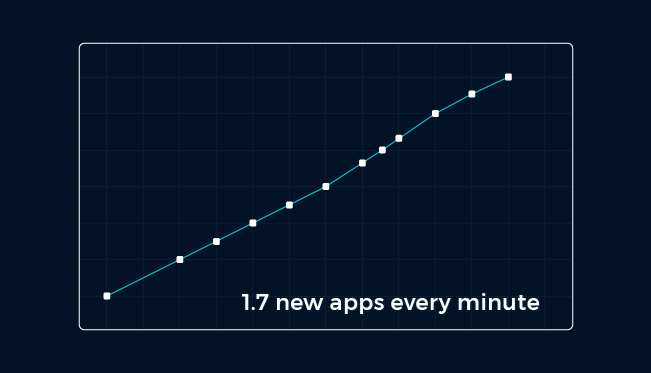
According to recent study by App Annie, an individual spends over 4 hours a day on their smartphones and on an average uses 9 applications everyday; Moreover they only end up using one third to one half of the installed apps in a month. What’s more interesting is that developers are releasing almost 1.7 new apps every minute, imagine the competition!

This is the very reason that we should learn and know as much as we can about the user to present them with an app that is designed keeping them at the centre. This exercise of research and learning the human defaults will only help you remain among the top 30 used apps on a users smartphone. So when we are investing so much time and money, why not invest it smartly?
“Know your user the way Heath Ledger knew Joker.”
